
Summary
- The Living Planet Index (LPI) is a metric that is easily misinterpreted.
- The LPI tells us the average change in abundance: the number of individuals in animal populations.
- It only includes vertebrate species – mammals, reptiles, amphibians, fish, and birds. It does not include insects, corals, plants, or fungi.
- The LPI reports a 68% average decline in wildlife populations since 1970. This does not tell us the number of individuals or species lost.
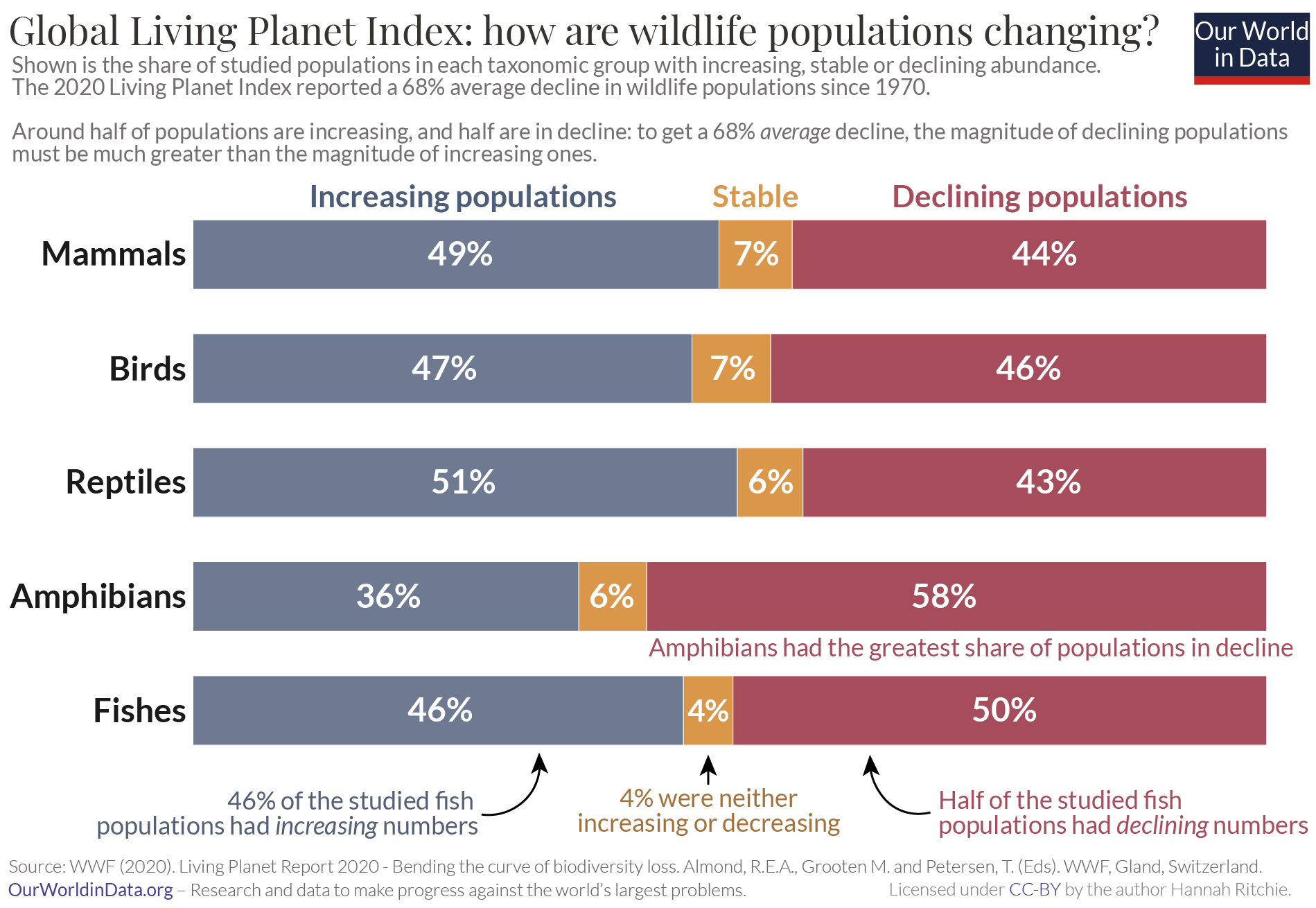
- Half of the populations were increasing in abundance, while half were in decline.
- Distilling population trends for more than 20,000 populations to a single index figure masks the large differences in biodiversity across the world.
- Averages don’t allow us to see the populations doing well, but also means we do not see the populations with the largest declines. This means we cannot focus conservation efforts on them.
- Latin America has seen the largest average decline in wildlife populations.
- Europe has seen the smallest average decline.
- Freshwater species have been badly affected with large declines across many species.
How the Living Planet project helps us understand how the world’s wildlife is changing
We need data to understand the world around us. There are few areas where gathering this data is more difficult than biodiversity.
There are millions of species on Earth. We don’t even know exactly how many species there are – the most-cited estimates are between 5 to 10 million. We have identified and described just over 2 million of them. And of course, species do not just live in one place: there are many populations of a single species spread across the world. That’s before we even get to the really challenging part of counting all of the individuals in each. Trying to understand what’s happening to an Amazonian frog species, almost too small to see with the naked eye, is no easy task. This work is really hard.
One project that I think deserves an immense amount of credit is the Living Planet Report, led by the Zoological Society of London (ZSL) and the World Wildlife Fund (WWF). You might know it from the infamous Living Planet Index which often hits the headlines. I’m going to distinguish the underlying project from the index because I think the index, and how it is interpreted, does a disservice to the incredible amount of work that they do.
The Living Planet project painstakingly brings together published data on the state of more than 20,000 wildlife populations from across the world. This captures everything from frogs to elephant species, rhinos to owls, from every continent on Earth. Better yet, they publish it freely as a downloadable database for everyone to use. I wish more people knew about the database itself, and not just the Living Planet Index headline.
For those working in conservation or environmental research and protection, digging into the specifics of the database is essential. For the more casual observer who just wants to understand what’s happening to the world’s wildlife, we need to find some way of summarising the 20,000 stories that it contains. The most popular way of doing this is by using the Living Planet Index: this reports the average decline across all of the populations as a single figure. The headline result is that we saw an average decline of 68% across wildlife populations since 1970.
I’m not a fan of the index because of how easily it is misinterpreted. In a related article, I look at what the misconceptions are, and what the index actually means.
I much prefer the summary shown in the chart here. It shows us what share of the 20,000 populations are declining, increasing, or are stable. Across all of the taxonomic groups, there is almost a 50-50 split: around half of the populations are in decline, and half are growing. This tells us a very different story from the single index figure. Many extrapolate the “average decline of 68%” to assume that most, if not all, of the world’s wildlife, is struggling. This more nuanced summary shows us that this is not the case.
This perspective has shaped a lot of my thinking about biodiversity loss. I don’t prefer it because it tells a more ‘positive’ story than the index itself. I prefer it because I think that understanding this improves our chances of saving the populations that are more endangered. There are a couple of reasons why.
First, understanding what populations are most threatened is how we prioritize our conservation efforts. There’s no point in misplacing resources towards populations that are flourishing at the expense of populations on the brink of extinction. We can only direct our attention towards the most endangered populations if we know what they are in the first place. Looking at the red segment – the declining populations – already cuts our sample by half. We still need to narrow it down further by looking at the populations that are seeing the most drastic declines. The underlying data in the Living Planet database allows researchers to do this.
Second, it shows us that the loss of wildlife is not inevitable. Despite the gloomy headlines, the biodiversity story is not all bad news –and thank goodness. Imagine if, after decades of conservation efforts, all of our wildlife was in decline. We might see it as futile to even try. Support for conservation relies on there being wildlife that needs saving. But it also relies on the belief that interventions can actually make a difference. If we didn’t see any positive trends we would have nothing to learn about what we can do. The stories of each of the populations that are increasing give us insights into what is going right. If we can understand it, we might be able to replicate it.
This chart captures both of these aspects. It shows us that much of our wildlife is in trouble. But it also shows us that this is not inevitable: we can turn things around if we want to.
The Living Planet project provides an essential resource to get us started on this. The database lets us dig deeper to see exactly which populations are most endangered, and where they are. The researchers and authors that bring this resource together deserve a lot of credit. I personally would like to thank them for shaping my thinking on biodiversity; for giving us the data-driven stories we need to understand the animals we share the planet with.
Living Planet Index: what does an average decline of 68% really mean?
IN THIS SECTION
- What does ‘average decline’ actually mean?
- The Living Planet Index tells us that studied animal populations have seen an average decline of 68% since 1970
- Effective conservation means we have to look past the average
“In the last 50 years, Earth has lost 68% of wildlife, all thanks to us humans” (India Times)
“Humanity has wiped out 60% of animal populations since 1970, report finds” (The Guardian)
“We’ve lost 60% of wildlife in less than 50 years” (World Economic Forum)
These are just three of many headlines covering the Living Planet Index. But they are all wrong. They are based on a misunderstanding of what the Living Planet Index shows.
I sympathize with the journalists. Interpreting this metric is hard. I’m sure I’ve made similar mistakes in the past: using the terms ‘decline’, ‘lost’, and ‘fall’ interchangeably in biodiversity discussions. Combine this with the complexities of ‘populations’, ‘species’, and ‘extinctions’, and it gets complicated pretty quickly.
Before reporting on the Living Planet Index we should understand what it actually tells us about the world’s wildlife. We should also be aware of the misconceptions and pitfalls of using this index to capture the changes in more than 20,000 of the world’s animal populations.
What does ‘average decline’ actually mean?
Black rhino (Tanzania) | Black rhino (Botswana) | Total (Tanzanian and Botswananian black rhinos) | |
| Population size in 1980 | 3795 | 30 | 3825 |
| Population size in 2017 | 160 | 50 | 210 |
| Number of animals lost since 1980 | 3635 | -20 (gained 20 rhinos) | 3615 |
| Percentage change in population size | -96% | +67% | -95% |
The Living Planet Index (LPI) measures the average change in the number of individuals across the world’s animal populations. A ‘population’ is defined as a species within a geographical area. So, despite being the same species, the African elephant in South Africa and Tanzania are counted as different populations.
Let’s take a look at an example to see how the LPI is calculated. This will not only show us how easily this figure can be misinterpreted but also why we should be careful when assuming that it gives us an accurate picture of what’s really happening to wildlife populations.
We’re going to take a real-life example of two populations of the Black rhino: one in Tanzania and one in Botswana. In the first row of the table, we see their population size in 1980: there were 3795 rhinos in Tanzania and only 30 in Botswana. In the following decades, intense poaching in Tanzania has plunged its population to critically endangered status: in the second row, we see that by 2017 there were only 160 rhinos left. Things in Botswana actually improved over time: its 30 rhinos increased to 50. The difference between their population size in 1980 and 2017 is shown in the third row: this represents the number of animals lost over time. And in the final row, we see the percentage change in population size for each.
The Tanzanian rhinos obviously did not fare well: they lost 96% of their population. The group in Botswana did much better. In fact, their numbers increased by 67%.
If we calculate the average change of these two populations – just as we would do in the LPI – we get a value of -15%. Take the average of the change in Tanzania (-96%) and Botswana (67%). This means the Black rhinos saw an average decline of 15%.3
The common misinterpretation of this – where headlines would incorrectly report that “we’ve lost 15% of animals” – is shown in the far right column. There we’ve summed these numbers to show the two populations combined. In 1980, the total number of animals was 3285. We then lost 3615 of them, to give us only 210 in 2017. This means we actually lost 95% of the rhinos. Not 15% as the LPI might wrongly suggest. The LPI is therefore a very different measure from the number or percentage of individual animals lost.
But this also highlights an even greater danger when reporting the LPI. By averaging these two populations we’ve ended up pretty clueless about the status of either of them. A 15% decline would suggest that the Black rhino is not doing particularly well, but has only seen a moderate decline over several decades. The true situation could not be more different. The Black rhino in Tanzania has lost 96% of its rhinos and has become critically endangered. On the other hand, something is going right in Botswana because its numbers have increased.
Seeing a moderate 15% decline might mean we don’t prioritize the Tanzanian black rhino when we really need to. And we might lose out on an important lesson from Botswana on how to increase the numbers of critically endangered populations. This is why a more population-specific approach to conservation is needed, as I discuss in the dropdown box at the end of this article.
The Living Planet Index tells us that studied animal populations have seen an average decline of 68% since 1970
Let’s then dig into the actual results of the LPI. The above headline is the main message of the 2020 Living Planet Index report.4 It tells us that from 1970 to 2016, there was an average decline of 68% across studied animal populations.
What types and how much of the world’s wildlife does the LPI cover? The latest report covered 20,811 populations of 4,392 species across the world. It only covers vertebrate species – mammals, birds, fish, reptiles, and amphibians. It includes a large number of populations from each world region, however, the tropics tend to be underrepresented relative to Europe and North America. This is not ideal, considering the tropics are home to the greatest diversity of species and is where wildlife is most threatened.
This reveals two further limitations. First, it only covers a tiny percentage of species: Only 15% of known bird species; 12% of mammals; 5% of fish; 4% of amphibians, and merely 2% of known reptile species. It’s hard to say how representative the available data is: it’s often the case that the species we are most concerned about (deservedly) get the most attention in the research. Second, many taxonomic groups are not included at all – nothing on insects, fungi, coral or plants. This is largely due to data availability – it’s easier to count bears than ants. Still, we should be wary of generalizing these results to all life on Earth. [In our FAQ on the Living Planet Index I look at the geographical and species breakdown of data availability, and where it’s sourced from].
The global LPI is shown in the chart, where the value in 1970 is indexed to 100%. As we see, this has fallen to 32% in 2016, signifying a 68% decline.
To be clear once again: the LPI does not tell us the number of species, populations or individuals lost; the number of extinctions that have occurred; or even the share of species that are declining. It tells us that between 1970 and 2016, on average, there was a 68% decline in population size across the 20,811 studied populations.
Effective conservation means we have to look past the average
To tell the real story of biodiversity, we have to be conscious of how the headlines are communicated. Losing 68% of the world’s wildlife within decades would be devastating. Thankfully it isn’t true.
But, this shouldn’t detract from the fact that the loss of many wildlife populations is deeply concerning. Unfortunately, averages are not particularly helpful in understanding what and where these populations are. When we look at more detailed analyses of the LPI we find that actually, this 68% average decline hides even more drastic declines in some populations. A few percent of the population is in a very steep decline [we look at the role of outliers in the LPI in the dropdown box at the end of this article]. If we want to protect our most endangered species, these are the ones we need to prioritize. The average index, unfortunately, hides these populations from view.
We need to not only be careful with how we report the headline index itself. But we also need to be aware of what it does, or more importantly, does not tell us about how global wildlife is changing. As I cover in a related article, the Living Planet database itself is an incredible resource that allows us to dig deeper into the individual stories of the 20,000 populations that have been reduced to a single number.
How the Living Planet Index is sensitive to outliers
An average isn’t helpful – we need to know where and what animal populations are in the greatest danger. Some are doing much worse than the headline suggests, but they get lost in the averages. This means we can’t focus our efforts on protecting the species that need it the most.
We should also be careful about what the average actually tells us. It can, quite easily, be sensitive to outliers: populations that have seen a dramatic decline or increase.
Let’s look at a simple example of how this might work: how would a population experiencing an extreme decline be reflected in an averaged result across several populations? Say we have five lizard populations. One of these populations has experienced a terrible 99% decline in numbers. The other four have not changed at all – they have just as many individuals as they did decades ago. When we calculate the average change across these five populations we get a 20% decline.5
This would be the headline we see in the news. But actually, this result is pretty useless. It does not tell us that most lizard populations are doing fine – we probably think they are shrinking. And worse, we are blind to the great peril of the one lizard population that is quickly vanishing. It has declined by 99%, but we only see the final result of a bad, but a more moderate, decline of 20%. These averages don’t allow us to prioritize our conservation efforts where they’re most needed.
There are other hypotheticals that make this clear: let’s say we had an ecosystem where one population saw a decline of 99%, and 393 other populations each increased by 1%. Our final result would report an average decline of 50%.6 This is the difference between what we’d call a ‘catastrophic decline’ (a decline across most or all species) versus a ‘cluster decline’ (where it is a very specific set of species that are struggling). Our approach to tackling either of these scenarios would be very different.
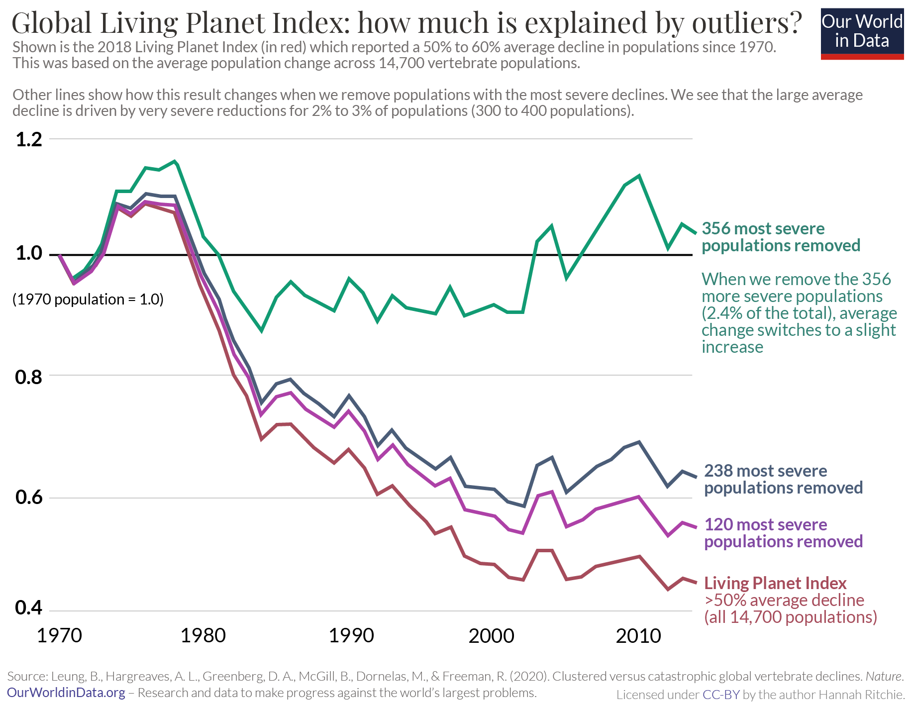
This is not just borne out in hypothetical examples. It’s reflected in the LPI results. In a study published in Nature, Brian Leung and colleagues looked at how the LPI was affected by extreme declines (or increases) in a small subset of the studied populations.7 For this study they looked at the results of the 2018 LPI Report – we’ll look at a similar analysis for the 2020 update soon. It reported a 60% average decline in wildlife populations since 1970.
By looking at the population data underlying the LPI they found that this 60% average decline was driven by extreme losses in a small subset of populations. If you excluded the 2.4% most strongly declining populations – which was 356 out of 14,700 – the result reversed from a 60% average decline to slightly positive growth. In other words, 2% to 3% of populations were doing extremely badly, but it appears that most species were doing okay.
In the chart, we see how the 2018 LPI result would have been affected by excluding the most extreme-negative populations. In red we see the final headline result of the report – a 60% average decline across the 14,700 population. But as we exclude the most extreme negative populations, first 120 then 238 populations, we see that this average decline reduces significantly. Then, when we exclude the 356 most severe populations, not only does the average decline reduce, it actually turns into a net positive. The abundance across these populations was, on average, increasing.

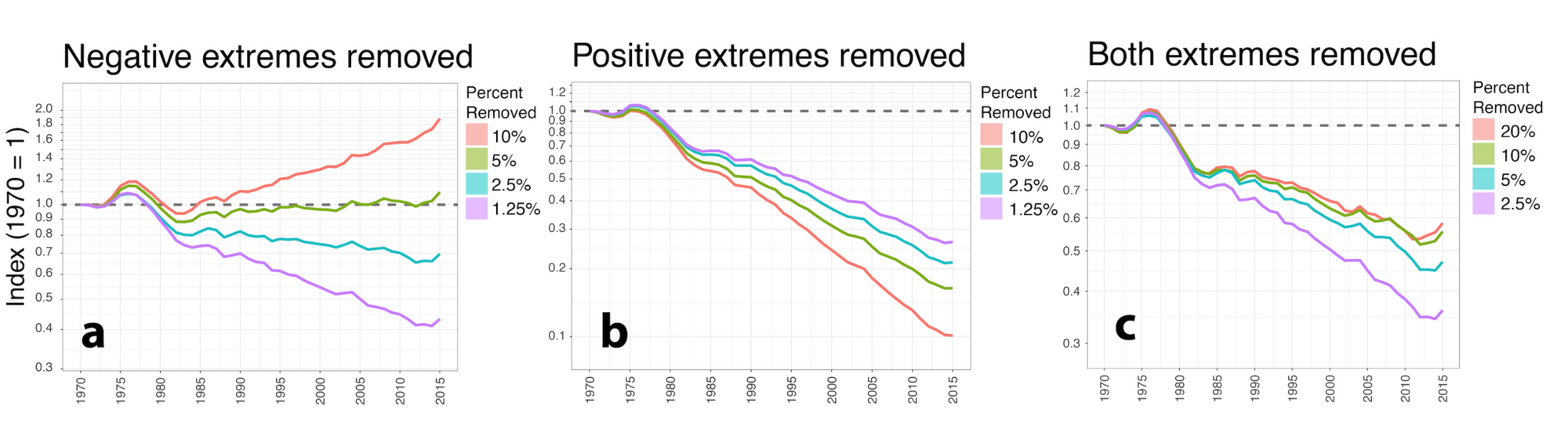
But, extreme positive outliers can also have a strong impact on the final result. In the 2020 update of the LPI, they updated this analysis to show the impact of removing extreme negative, extremely positive, and both outliers combined. This is shown in the chart. Again we see the impact of removing negative extremes: removing the most severe 5% of the population turns the average 68% decline into an average increase. But removing positive extremes also has a large impact. When we remove even a few percent of the population growing the most, we see an average decline of greater than 70%. Finally, if you remove both negative and positive outliers together we still see a significant average decline, although less than the reported LPI of 68%. If we remove the most extreme 10% of the population we get a 42% average decline since 1970.
To be clear: these analyses do not undermine the severity of global wildlife losses. Even if we remove extreme outliers we still see a significant decline. But what they do highlight is how much we miss by reporting a simple global index value. We miss the few hundred species that have seen very dramatic declines. By mixing them into a single global index they have been completely lost from the headlines. Our priorities should be on protecting these populations, but we can’t because they have been lost in the noise. And we also fail to understand what populations across the world continue to do well and why. We assume that most species must be doing poorly.
What is more useful for conservation is looking at clustered declines: cutting through the average to identify where and what types of populations are seeing dramatic declines. Leung et al. (2020) highlighted several clusters of species that have struggled: reptile, amphibian, and mammal species across Latin America; Indo-Malayan freshwater birds and amphibians; Arctic mammals; and both marine and freshwater fishes across most of the world’s environments.
How does the Living Planet Index vary across the world?
IN THIS SECTION
- Living Planet Index by region
- Freshwater species have been greatly affected
Living Planet Index by region
Now, with an understanding of what the LPI can and cannot tell us about the state of the world’s wildlife, we can take a closer look at the results. Globally, the average decline has been 68% since 1970. But, as we’d expected given the points raised above, this trend varies a lot from continent to continent.
In the chart, we see the LPI given by region. Again, this is measured relative to 1970, which is assigned a value of one.
Latin America and the Caribbean
Latin America and the Caribbean have seen the most severe decline of any region. It experienced an average decline of 94% across its studied populations. When we think about the changes in some of the leading drivers of biodiversity loss, we should not be surprised that Latin America has been badly affected. In recent decades it has experienced intense deforestation and expansion of agricultural land: the primary driver of habitat loss. It is also a biodiversity hotspot, being home to many endemic (unique) tropical species. These species are often highly specialized and don’t adapt well to changes in local conditions.
The LPI highlights the conversion of grasslands, forests, wetlands, and the harvesting of species for hunting and poaching as the main contributors to this decline. It was most severe for fish, reptiles, and amphibians.
North America
The trend for North America is one of two halves. Since 1970, it has experienced an average decline of one-third (33%). But, most of this occurred before the year 2000. After a steady decline through the 1970s, 80s, and 90s, the trend seems to have stabilized from the turn of the millennium. In fact, the average trend might be slightly increasing.
Europe and Central Asia
Europe has seen the smallest decline of all of the continents. An average decline of 24% since 1970. This paints a less severe picture for biodiversity in Europe and Central Asia and is attributed in part to successful conservation efforts. For example, most countries in Europe are afforesting and restoring wild ecosystems.
It’s also true that most of the continent’s transformation – the expansion of agriculture, deforestation, and destruction of habitats – occurred well before 1970. It is a history that goes back centuries. In other words, its biodiversity was already in a very depleted state. We’d expect that any declines in the region would be less severe.
Africa
Africa is still rich in biodiversity. It’s the only continent with a significant number of large mammals left. Unfortunately, it has seen a dramatic decline in recent decades. An average decline of two-thirds (65%) since 1970.
Like Latin America, the main drivers of this are habitat loss for expanding agriculture, and the overexploitation of animals for hunting, poaching, and wildlife trade. Looking at initial trends in the continent’s subregions, it looks like the decline has been most severe in West, Central, and East Africa. Populations have been more stable in the North and South.
Asia-Pacific
The Asia-Pacific spans a wide range of countries and habitats. It includes large terrestrial landscapes, but also many small island states. This means it’s home to a large number of endemic species and unique ecosystems.
Since 1970, it has experienced an average decline of 45%. But there are initial signs that this is changing. We’ve seen a positive trend since 2010. This has been seen clearly in population trends for several species of reptiles and amphibians.
Freshwater species have been greatly affected
There is one particular environment that has experienced an incredibly severe decline: the world’s freshwaters.
Almost one-third of freshwater species are threatened with extinction. Freshwater species are at a higher risk of extinction compared to terrestrial species. This bleak reality is also reflected in trends within the LPI.
The LPI covers 3,741 freshwater populations across 944 species. Not a small, limited sample. Since 1970, the average decline has been 84%. That’s a 4% decline every year. Most of this decline has come from reptiles, amphibians, and fishes. Particularly across Latin America and the Caribbean.
Overfishing and overharvesting of freshwater amphibians and reptiles – which are often traded in markets for their body parts, or for medicinal uses – is one of the biggest threats to these species. Freshwaters are also polluted by many different types of waste: agricultural waste from manure and fertilizers, industrial discharge, and domestic waste. This can very quickly tip the balance of species within freshwaters. The diversion of rivers and the use of dams can also alter the habitats for these species.
Conservation efforts in these environments are also more difficult because it usually requires input from multiple sectors. The allocation of responsibility for water is not as straightforward as for land. Just like terrestrial mammals, it’s the megafauna (the largest species) that are at the greatest risk. Freshwater megafauna is species that grow to more than 30 kilograms and include animals such as Mekong giant catfish, river dolphins, otters, beavers, and hippos. All of these are targeted by humans. What makes them especially vulnerable is that they reproduce at much slower rates and have fewer offspring. This makes it more difficult for them to restore their populations that have been depleted.
FAQs on the Living Planet Index
IN THIS SECTION
- What does the Living Planet Index (LPI) measure?
- What does the Living Planet Index (LPI) not measure?
- What types of species are included?
- How many species does it cover? What is the geographical range of this coverage?
- What percentage of known species are included in the LPI?
- Where does the data for the LPI come from?
- What does the LPI show?
- Are all studied wildlife populations in decline?
What does the Living Planet Index (LPI) measure?
The Living Planet Index (LPI) provides a measure of wildlife abundance. It measures the average decline in population size since 1970 across a wide range of species.
What does the Living Planet Index (LPI) not measure?
The Living Planet Index does not measure:
- Number of species lost
- Number of populations or individuals that have been lost
- Number or percentage of species or populations that are declining
- Number of extinctions
What types of species are included?
The LPI only includes data from vertebrate populations. This includes mammals, birds, reptiles, amphibians, and fish. Taxonomic groups including insects, corals, fungi, and plants are not included.
How many species does it cover? What is the geographical range of this coverage?
| Region | Number of species included | Number of populations included |
| Global | 4,392 | 20,811 |
| Africa | 371 | 1,318 |
| North America | 944 | 2,473 |
| Latin America & Caribbean | 761 | 1,159 |
| Asia-Pacific | 581 | 2,167 |
| Europe-Central Asia | 608 | 4,283 |
In its latest report, published in 2020, 20,811 populations across 4,392 species were included. It includes species and populations across all continents. This breakdown is given in the table.
What percentage of known species are included in the LPI?
| Taxonomic group | Number of populations included | Number of species included | Percentage of known species that are included |
| Birds | 6,666 | 1,586 | 15% |
| Mammals | 4,422 | 658 | 12% |
| Fish | 8,412 | 1,635 | 5% |
| Amphibians and Reptiles | 1,311 | 513 | 3% |
Only vertebrate species are included in the LPI: this includes mammals, birds, reptiles, amphibians, and fish. Taxonomic groups including insects, corals, fungi, and plants are not included.
Only a small percentage of known species in these groups are included. The number of populations and species from each group is shown in the table. This also details the percentage of known species that are included.
Where does the data for the LPI come from?
The underlying data for the LPI comes from a combination of published scientific articles, online databases, and government reports. To be included, data points must contain a time series of vertebrate populations spanning any number of years from 1970 onwards. The most recent report (the Living Planet Index 2020) collated this data from more than 3,000 individual data sources.
What does the LPI show?
The latest results from the LPI indicate an average decline in the studied wildlife populations of 68% between 1970 and 2016.
Note that this does not mean that we have lost 68% of wildlife over this period. For a clear example of why this is the wrong conclusion, and how the LPI is calculated, see our example here.
Are all studied wildlife populations in decline?
No, the results of the LPI show that around half of the studied species are increasing in abundance, while half are declining. The fact that there is such a large average decline suggests that the magnitude of the decline across many species is much larger than the magnitude for increasing species.