
Environmental impacts of food and agriculture
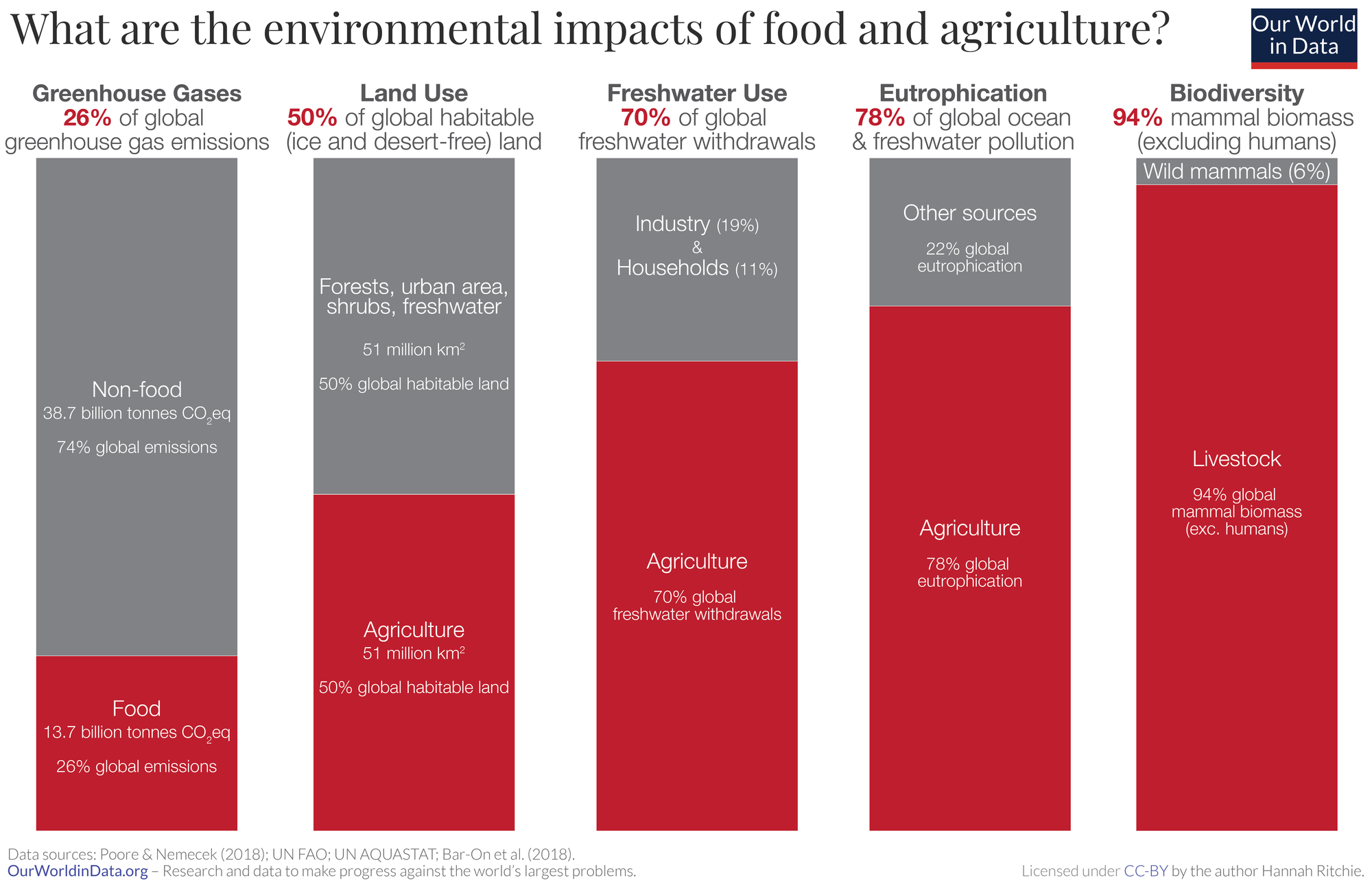
What are the environmental impacts of food and agriculture?
The visualization here shows a summary of some of the main global impacts:
- Food accounts for over a quarter (26%) of global greenhouse gas emissions;
- Half of the world’s habitable (ice- and desert-free) land is used for agriculture;
- 70% of global freshwater withdrawals are used for agriculture;
- 78% of global ocean and freshwater eutrophication (the pollution of waterways with nutrient-rich pollutants) is caused by agriculture;
- 94% of mammal biomass (excluding humans) is livestock. This means livestock outweigh wild mammals by a factor of 15-to-1. Of the 28,000 species evaluated to be threatened with extinction on the IUCN Red List, agriculture and aquaculture is listed as a threat for 24,000 of them.
Food, therefore, lies at the heart of trying to tackle climate change, reducing water stress, pollution, restoring lands back to forests or grasslands, and protecting the world’s wildlife.
Land Use
IN THIS SECTION
- Half of the world’s habitable land is used for agriculture
- Land use footprint of food
- Distribution of land use for foods
Half of the world’s habitable land is used for agriculture
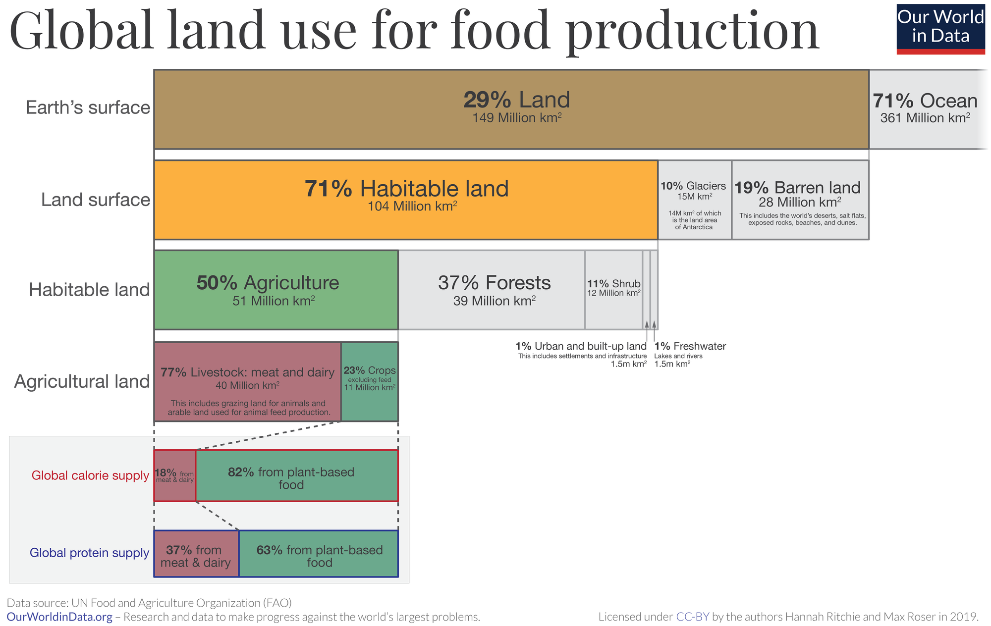
For much of human history, most of the world’s land was wilderness: forests, grasslands and shrubbery dominated its landscapes. Over the last few centuries, this has changed dramatically: wild habitats have been squeezed out by turning it into agricultural land.
If we rewind 1000 years, it is estimated that only 4 million square kilometers – less than 4% of the world’s ice-free and non-barren land area was used for farming.
In the visualization we see the breakdown of global land area today. 10% of the world is covered by glaciers, and a further 19% is barren land – deserts, dry salt flats, beaches, sand dunes, and exposed rocks.6 This leaves what we call ‘habitable land’. Half of all habitable land is used for agriculture.7
This leaves only 37% for forests; 11% as shrubs and grasslands; 1% as freshwater coverage; and the remaining 1% – a much smaller share than many suspect – is built-up urban area which includes cities, towns, villages, roads and other human infrastructure.
There is also a highly unequal distribution of land use between livestock and crops for human consumption. If we combine pastures used for grazing with land used to grow crops for animal feed, livestock accounts for 77% of global farming land. While livestock takes up most of the world’s agricultural land it only produces 18% of the world’s calories and 37% of total protein.
The expansion of agriculture has been one of humanity’s largest impacts on the environment. It has transformed habitats and is one of the greatest pressures for biodiversity: of the 28,000 species evaluated to be threatened with extinction on the IUCN Red List, agriculture is listed as a threat for 24,000 of them.9 But we also know that we can reduce these impacts – both through dietary changes, by substituting some meat with plant-based alternatives and through technology advances. Crop yields have increased significantly in recent decades, meaning we have spared a lot of land from agricultural production: globally, to produce the same amount of crops as in 1961, we need only 30% of the farmland.
With solutions from both consumers and producers, we have an important opportunity to restore some of this farmland back to forests and natural habitats.
Land use footprint of food
How do the land footprint of different food products compare? Which foods used the most and least land in their production?
We can look at these comparisons based on mass: the land used to produce one kilogram of food product.
But it’s also important to look at these comparisons in terms of nutritional units: this gives a measure of how low or high-impact different foods are in supplying protein or energy/calories.
In the visualizations here we show the land footprint of foods, measured in meters squared (m2) per kilogram, 100 grams of protein, and per 1000 kilocalories. These charts are interactive so you can add and remove products using the ‘add food’ button.
Distribution of land use for foods
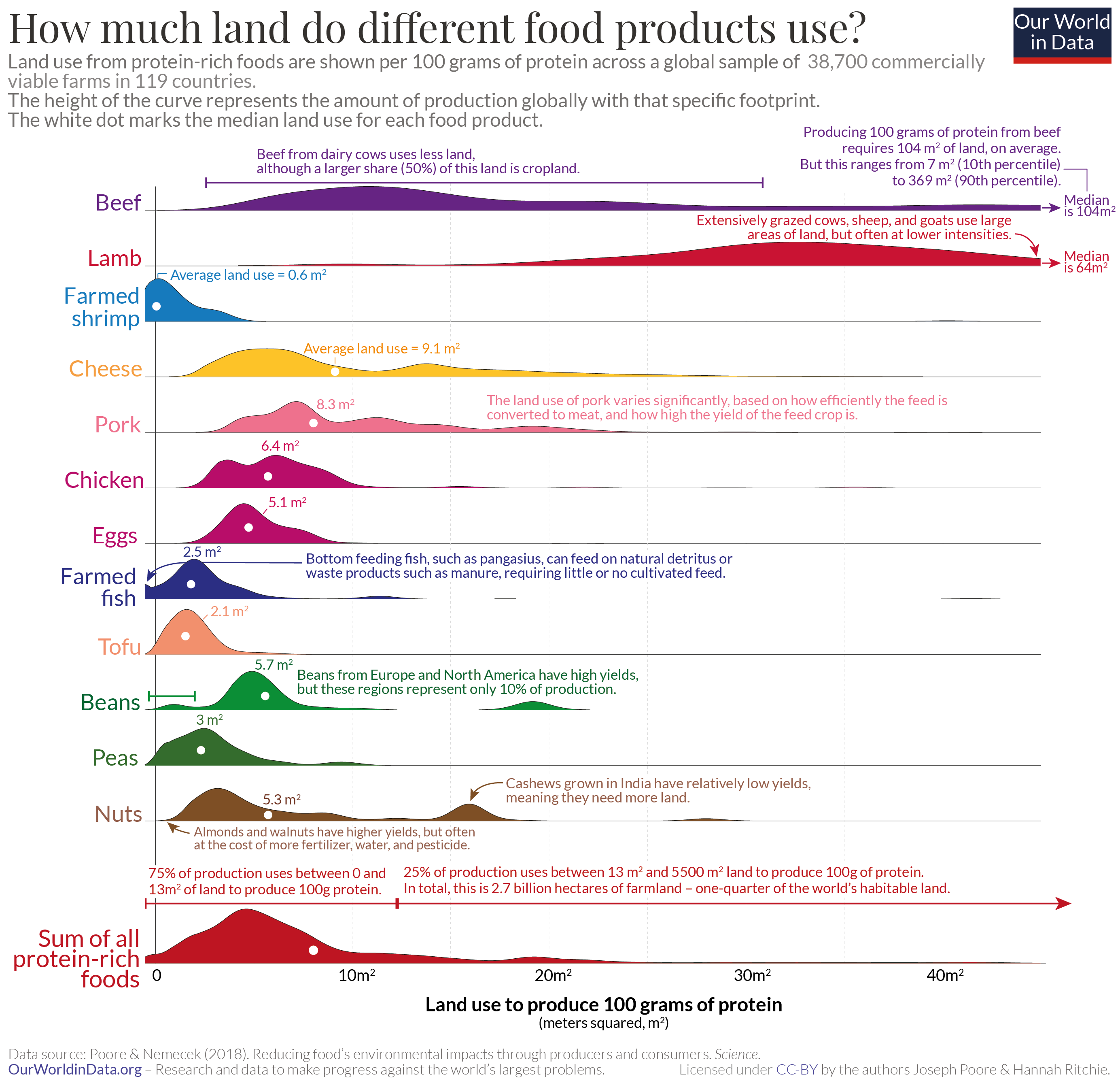
Most charts which compare the land footprint of different food products look at the average value for each. This is a useful comparison, but could mask large differences in land footprints depending on where and how they are produced.
Let’s take a look at the full range of land footprints for protein-rich foods.
This is shown in the visualization. The data is from the largest meta-analysis of global food systems to date, published in Science by Joseph Poore and Thomas Nemecek (2018). In this study, the authors looked at data across more than 38,000 commercial farms in 119 countries. Land use here is measured in meters squared (m2) of agricultural and – which includes pasture and land for crops or animal feed – per 100 grams of protein.
The visualization shows the median footprint – highlighted by a small white circle for each food product.
But since there are large differences between producers, this chart also shows the full spectrum of land use – from the lowest to highest producers. The height at each point in the curve represents the amount of global production with that specific footprint.
The median footprint for beef is 104 m2 per 100 grams of protein. But the range across producers is huge: spanning from 7 m2 to 369 m2.
The land use of foods are largely dependent on the intensity of farming. This is certainly true for crops: higher yields mean they need less land. But also for livestock: animals fed on crops with very high yields will need less land.
CO2 and Greenhouse Gas Emissions
IN THIS SECTION
- Food production is responsible for one-quarter of the world’s greenhouse gas emissions
- You want to reduce the carbon footprint of your food? Focus on what you eat, not whether your food is local
- Less meat is nearly always better for your carbon footprint than sustainable meat
- The carbon footprint of EU diets: where do emissions come from?
- Carbon footprint of food products
- Breakdown of where food system emissions come from
Food production is responsible for one-quarter of the world’s greenhouse gas emissions
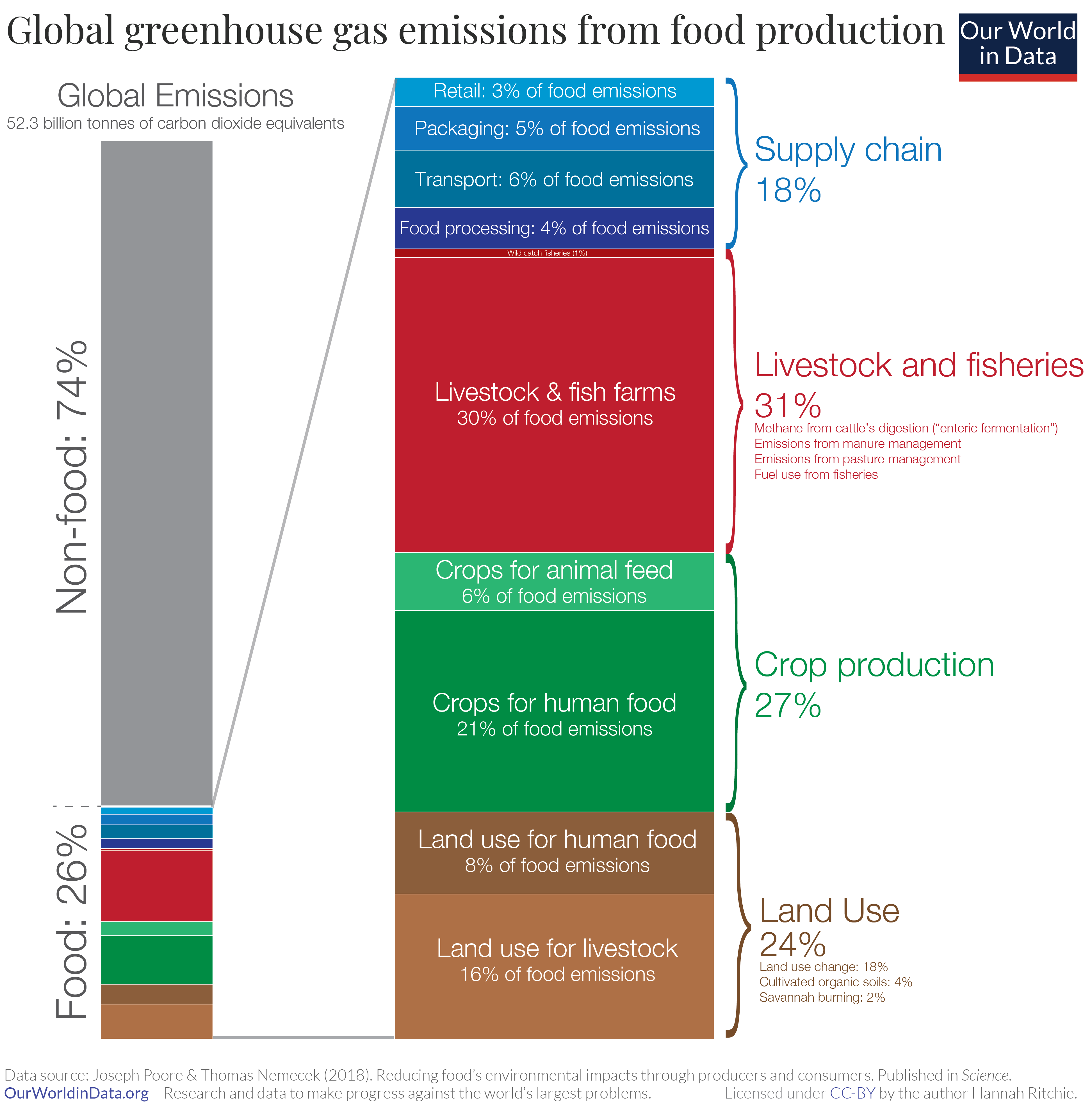
When it comes to tackling climate change, the focus tends to be on ‘clean energy’ solutions – the deployment of renewable or nuclear energy; improvements in energy efficiency; or transition to low-carbon transport. Indeed, energy, whether in the form of electricity, heat, transport or industrial processes, account for the majority – 76% – of greenhouse gas (GHG) emissions.
But the global food system, which encompasses production, and post-farm process such as processing, and distribution is also a key contributor to emissions. And it’s a problem for which we don’t yet have viable technological solutions.
The visualization shown here – based on data from the meta-analysis by Joseph Poore and Thomas Nemecek (2018), published in Science – summarizes food’s share of total emissions and breaks it down by source.
Food is responsible for approximately 26% of global GHG emissions.
There are four key elements to consider when trying to quantify food GHG emissions. These are shown by category in the visualization:
Livestock & fisheries account for 31% of food emissions.
Livestock – animals raised for meat, dairy, eggs and seafood production – contribute to emissions in several ways. Ruminant livestock – mainly cattle – for example, produce methane through their digestive processes (in a process known as ‘enteric fermentation’). Manure management, pasture management, and fuel consumption from fishing vessels also fall into this category. This 31% of emissions relates to on-farm ‘production’ emissions only: it does not include land use change or supply chain emissions from the production of crops for animal feed: these figures are included separately in the other categories.
Crop production accounts for 27% of food emissions.
21% of food’s emissions comes from crop production for direct human consumption, and 6% comes from the production of animal feed. They are the direct emissions which result from agricultural production – this includes elements such as the release of nitrous oxide from the application of fertilizers and manure; methane emissions from rice production; and carbon dioxide from agricultural machinery.
Land use accounts for 24% of food emissions.
Twice as many emissions result from land use for livestock (16%) as for crops for human consumption (8%).13Agricultural expansion results in the conversion of forests, grasslands and other carbon ‘sinks’ into cropland or pasture resulting in carbon dioxide emissions. ‘Land use’ here is the sum of land use change, savannah burning and organic soil cultivation (plowing and overturning of soils).
Supply chains account for 18% of food emissions.
Food processing (converting produce from the farm into final products), transport, packaging and retail all require energy and resource inputs. Many assume that eating local is key to a low-carbon diet, however, transport emissions are often a very small percentage of food’s total emissions – only 6% globally. Whilst supply chain emissions may seem high, at 18%, it’s essential for reducing emissions by preventing food waste. Food waste emissions are large: one-quarter of emissions (3.3 billion tonnes of CO2eq) from food production ends up as wastage either from supply chain losses or consumers. Durable packaging, refrigeration and food processing can all help to prevent food waste. For example, wastage of processed fruit and vegetables is ~14% lower than fresh, and 8% lower for seafood.
Reducing emissions from food production will be one of our greatest challenges in the coming decades. Unlike many aspects of energy production where viable opportunities for upscaling low-carbon energy – renewable or nuclear energy – are available, the ways in which we can decarbonize agriculture are less clear. We need inputs such as fertilizers to meet growing food demands, and we can’t stop cattle from producing methane. We will need a menu of solutions: changes to diets; food waste reduction; improvements in agricultural efficiency; and technologies that make low-carbon food alternatives scalable and affordable.
You want to reduce the carbon footprint of your food? Focus on what you eat, not whether your food is local
People across the world are becoming increasingly concerned about climate change: 8-in-10 people see climate change as a major threat to their country.
As I have shown before, food production is responsible for one-quarter of the world’s greenhouse gas emissions.
There is rightly a growing awareness that our diet and food choices have a significant impact on our carbon ‘footprint’. What can you do to really reduce the carbon footprint of your breakfast, lunches, and dinner?
‘Eating local’ is a recommendation you hear often – even from prominent sources, including the United Nations. While it might make sense intuitively – after all, transport does lead to emissions – it is one of the most misguided pieces of advice.
Eating locally would only have a significant impact if transport was responsible for a large share of food’s final carbon footprint. For most foods, this is not the case.
GHG emissions from transportation make up a very small amount of the emissions from food and what you eat is far more important than where your food traveled from.
Where do the emissions from our food come from?
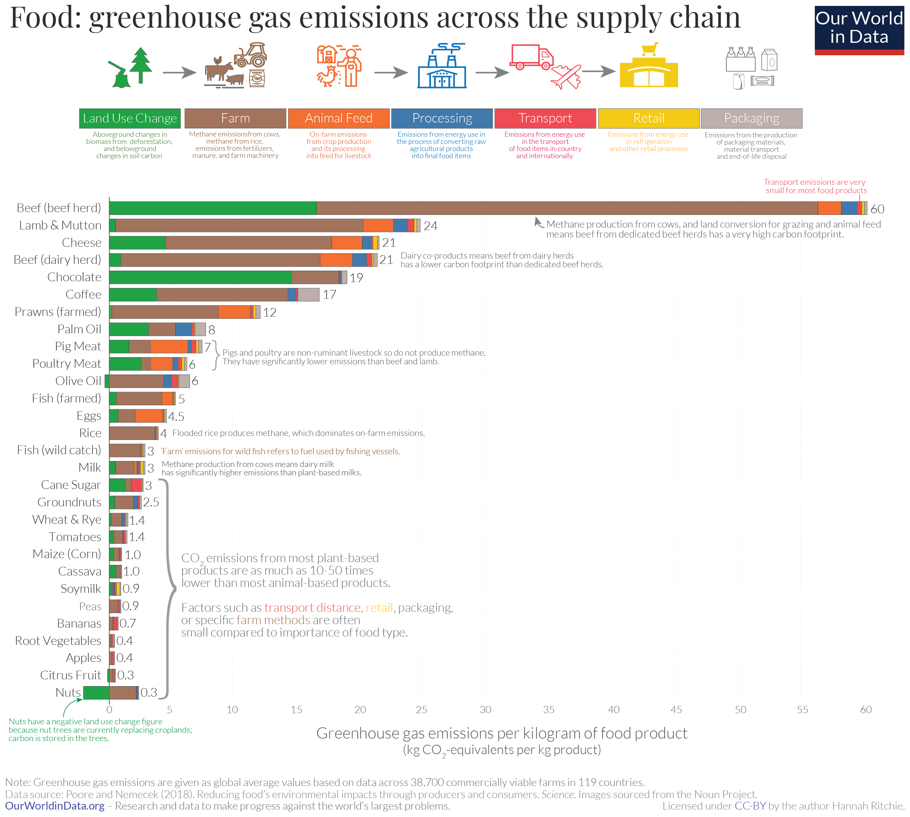
In the visualization we see GHG emissions from 29 different food products – from beef at the top to nuts at the bottom.
For each product you can see from which stage in the supply chain its emissions originate. This extends from land use changes on the left, through to transport and packaging on the right.
This is data from the largest meta-analysis of global food systems to date, published in Science by Joseph Poore and Thomas Nemecek (2018).
In this study, the authors looked at data across more than 38,000 commercial farms in 119 countries.
In this comparison we look at the total GHG emissions per kilogram of food product. CO2 is the most important GHG, but not the only one – agriculture is a large source of the greenhouse gases methane and nitrous oxide. To capture all GHG emissions from food production researchers therefore express them in kilograms of ‘carbon dioxide equivalents’. This metric takes account not just CO2 but all greenhouse gases.
The most important insight from this study: there are massive differences in the GHG emissions of different foods: producing a kilogram of beef emits 60 kilograms of greenhouse gases (CO2-equivalents). While peas emits just 1 kilogram per kg.
Overall, animal-based foods tend to have a higher footprint than plant-based. Lamb and cheese both emit more than 20 kilograms CO2-equivalents per kilogram. Poultry and pork have lower footprints but are still higher than most plant-based foods, at 6 and 7 kg CO2-equivalents, respectively.
For most foods – and particularly the largest emitters – most GHG emissions result from land use change (shown in green), and from processes at the farm stage (brown). Farm-stage emissions include processes such as the application of fertilizers – both organic (“manure management”) and synthetic; and enteric fermentation (the production of methane in the stomachs of cattle). Combined, land use and farm-stage emissions account for more than 80% of the footprint for most foods.
Transport is a small contributor to emissions. For most food products, it accounts for less than 10%, and it’s much smaller for the largest GHG emitters. In beef from beef herds, it’s 0.5%.
Not just transport, but all processes in the supply chain after the food left the farm – processing, transport, retail and packaging – mostly account for a small share of emissions.
This data shows that this is the case when we look at individual food products. But studies also shows that this holds true for actual diets; here we show the results of a study which looked at the footprint of diets across the EU. Food transport was responsible for only 6% of emissions, whilst dairy, meat and eggs accounted for 83%.
Eating local only slightly reduces your emissions
Eating local beef or lamb has many times the carbon footprint of most other foods. Whether they are grown locally or shipped from the other side of the world matters very little for total emissions.
Transport typically accounts for less than 1% of beef’s GHG emissions: choosing to eat local has very minimal effects on its total footprint. You might think this figure is strongly dependent on where in the world you live, and how far your beef will have to travel, but in the ‘dropdown box’ below I work through an example to show why it doesn’t make a lot of difference.
Whether you buy it from the farmer next door or from far away, it is not the location that makes the carbon footprint of your dinner large, but the fact that it is beef.
Example: how much does distance traveled impact the footprint of beef?
You might think this figure is strongly dependent on where in the world you live, and how far your beef will have to travel. If you live somewhere very remote you’d assume this must be much, much larger than if your beef is produced by your local farmer. But the key point here is that the difference in transport figures is very small relative to the total footprint of beef.
Let’s take the example of beef from a beef herd – the average footprint is approximately 60 kilograms of CO2eq per kilogram of beef. Let’s compare the transport footprint of buying from your local farmer (who turns out to be your neighbor), versus someone in the UK buying beef from Central America (approximately 9000 kilometers away).
Transporting food by boat emits 23 grams of CO2eq per tonne of product per kilometer. To transport the 9000 kilometers from Central America to the UK therefore emits 0.207 kilograms CO2eq [9000km * 23g per tonne-kilometer / 1000 / 1000 = 0.207 kg CO2eq per kg]. This is equivalent to 0.35% of the total footprint of the 60 kilograms of CO2eq per kilogram of beef.
If you buy from your local farmer – let’s assume you walk there, and have zero transport emissions – your beef footprint is 59.8 kilograms CO2eq per kilogram [we calculate this as 60kg – 0.2kg]. It makes almost no difference.
Especially for foods with a large footprint, transport as a share of the food’s total emissions is fairly insensitive to the distance travelled.
In a study published in Environmental Science & Technology, Christopher Weber and Scott Matthews (2008) investigated the relative climate impact of food miles and food choices in households in the US. Their analysis showed that substituting less than one day per week’s worth of calories from beef and dairy products to chicken, fish, eggs, or a plant-based alternative reduces GHG emissions more than buying all your food from local sources.
By analysing consumer expenditure data, the researchers estimated that the average American household’s food emissions were around 8 tonnes of CO2eq per year. Food transport accounted for only 5% of this (0.4 tCO2eq). This means that if we were to take the case where we assume a household sources all of their food locally, the maximum reduction in their footprint would be 5%. This is an extreme example because in reality there would still be small transport emissions involved in transporting food from producers in your area.
They estimated that if the average household substituted their calories from red meat and dairy to chicken, fish or eggs just one day per week they would save 0.3 tCO2eq. If they replaced it with plant-based alternatives they would save 0.46 tCO2eq. In other words, going ‘red meat and dairy-free’ (not totally meat-free) one day per week would achieve the same as having a diet with zero food miles.
There are also a number of cases where eating locally might in fact increase emissions. In most countries, many foods can only be grown and harvested at certain times of the year. But consumers want them year-round. This gives us three options: import goods from countries where they are in-season; use energy-intensive production methods (such as greenhouses) to produce them year-round; or use refrigeration and other preservation methods to store them for several months. There are many examples of studies which show that importing often has a lower footprint.
Hospido et al. (2009) estimate that importing Spanish lettuce to the UK during winter months results in three to eight times lower emissions than producing it locally. The same applies for other foods: tomatoes produced in greenhouses in Sweden used 10 times as much energy as importing tomatoes from Southern Europe where they were in-season.
Avoid the small share of foods that are air-freighted
The impact of transport is small for most products, but there is one exception: those which travel by air.
Many believe that air-freight is more common than it actually is. Very little food is air-freighted; it accounts for only 0.16% of food miles. But for the few products which are transported by air, the emissions can be very high: it emits 50 times more CO2eq than boat per tonne kilometre.
Many of the foods people assume to come by air are actually transported by boat – avocados and almonds are prime examples. Shipping one kilogram of avocados from Mexico to the United Kingdom would generate 0.21kg CO2eq in transport emissions. This is only around 8% of avocados’ total footprint. Even when shipped at great distances, its emissions are much less than locally-produced animal products.
Which foods are air-freighted? How do we know which products to avoid?
They tend to be foods which are highly perishable. This means they need to be eaten soon after they’ve been harvested. In this case, transport by boat is too slow, leaving air travel as the only feasible option.
Some fruit and vegetables tend to fall into this category. Asparagus, green beans and berries are common air-freighted goods.
It is often hard for consumers to identify foods that have travelled by air because they’re rarely labeled as such. This makes them difficult to avoid. A general rule is to avoid foods that have a very short shelf-life and have traveled a long way (many labels have the country of ‘origin’ which helps with this). This is especially true for foods where there is a strong emphasis on ‘freshness’: for these products, transport speed is a priority.
So, if you want to reduce the carbon footprint of your diet, avoid air-freighted foods where you can. But beyond this, you can have a larger difference by focusing on what you eat, rather than ‘eating local’. Eating less meat and dairy, or switching from ruminant meat to chicken, pork, or plant-based alternatives will reduce your footprint by much more.
Less meat is nearly always better for your carbon footprint than sustainable meat
What is the best way to reduce the carbon footprint of our diet?
I have shown previously that what we choose to eat has the largest impact, making a bigger difference than how far our food has traveled, or how much packaging it’s wrapped in. This is because only a small fraction comes from transport and packaging and most of our food emissions come from processes on the farm, or from land use change.
Regardless of whether you compare the footprint of foods in terms of their weight (e.g. one kilogram of cheese versus one kilogram of peas); protein content ; or calories, the overall conclusion is the same: plant-based foods tend to have a lower carbon footprint than meat and dairy. In many cases a much smaller footprint.
As an example: producing 100 grams of protein from peas emits just 0.4 kilograms of carbon dioxide equivalents (CO2eq). To get the same amount of protein from beef, emissions would be nearly 90 times higher, at 35 kgCO2eq.
But it comes with the caveat that comparisons are made based on global averages.
Many argue that this overlooks the large variation in the footprints of foods across the world. Using global averages might give us a misleading picture for some parts of the world or some producers. If I source my beef or lamb from low-impact producers, could they have a lower footprint than plant-based alternatives?
The evidence suggests, no: plant-based foods emit fewer greenhouse gases than meat and dairy, regardless of how they are produced.
Let’s take a look at the full range of footprints for protein-rich foods.
Protein-rich foods account for the bulk of our dietary emissions. In European diets, meat, dairy and eggs account for 83%. That’s why I focus on them here.
In the visualization we see the range of carbon footprints for these foods. This data is from the largest meta-analysis of global food systems to date, published in Science by Joseph Poore and Thomas Nemecek (2018). In this study, the authors looked at data across more than 38,000 commercial farms in 119 countries.
All greenhouse gas (GHG) emissions are measured in kilograms of carbon dioxide equivalents per 100 grams of protein; this metric takes account of not only carbon dioxide but also the range of other greenhouse gases – this is further explained in the footnote. To make reading less repetitive, I refer to it as ‘kgCO2eq’ below.
The visualization shows the median footprint – highlighted by a small white circle for each food product.
But since there are large differences between producers, this chart also shows the full spectrum of emissions – from the lowest to highest producers. The height at each point in the curve represents the amount of global production with that specific footprint.
The median footprint for beef is 25 kgCO2eq. But some producers have a much higher footprint: ten percent emit more than 105 kgCO2eq per 100 grams. At the other end, some are much lower. Ten percent emit less than 9 kgCO2eq. We see from the height of the curve that most beef production lies in the range between 17 to 27 kgCO2eq.
How do the distributions between plant-based and meat-based sources compare?
Plant-based protein sources – tofu, beans, peas and nuts – have the lowest carbon footprint. This is certainly true when you compare average emissions. But it’s still true when you compare the extremes: there’s not much overlap in emissions between the worst producers of plant proteins, and the best producers of meat and dairy.
Let’s compare the highest-impact producers (the top ten percent) of plant-based proteins with the lowest-impact producers (the bottom ten percent) of meat and dairy.
The pea producers with the highest footprint emit just 0.8 kgCO2eq per 100 grams of protein. For nuts it is 2.4 and for tofu, 3.5 kgCO2eq. All are several times less than the lowest impact lamb (12 kgCO2eq) and beef (9 kgCO2eq). Emissions are also lower than those from the best cheese and pork (4.5 kgCO2eq); and slightly lower or comparable to those from the lowest-footprint chicken (2.4 kgCO2eq).
If you want a lower-carbon diet, eating less meat is nearly always better than eating the most sustainable meat.
This is also true for the differences between meat products. Chicken, eggs, and pork nearly always have a lower footprint than beef and lamb: there is some, but not much overlap between the worst poultry and pork producers, and the best beef and lamb producers. The world’s highest impact chicken and pork have a footprint of 12 and 14 kgCO2eq. This is similar to, or only slightly higher than, the world’s best beef and lamb.
Regardless of where you get your beef or lamb from, substituting with chicken and pork is likely to reduce your carbon footprint.
More sustainable meat production can still make a big difference
Eating less meat, or switching to lower impact meats such as chicken, eggs or pork is the most effective way for individuals to reduce their dietary footprint.
But if you want to eat meat, then the choice of meat also matters. Consumers can have an impact, but so can food producers.
The world is not going to abandon livestock farming completely – at least not any time soon. And there are a number of reasons we wouldn’t want it to: it is not only an important source of income for many, but can also be a key source of nutrition in local settings. Particularly in lower-income countries where diets lack diversity, small amounts of meat and dairy can be an essential source of protein and micronutrients.
Globally, greenhouse gas emissions are massively skewed towards high-impact producers. This can be seen at the bottom of our visualization. The red curve shows the sum of all protein products.
Most of the protein we produce is relatively low-impact: 75% of production has a footprint between -3 and 11 kgCO2eq per 100 grams of protein. This creates just 30% of protein’s emissions.
High-impact production – with a footprint greater than 11 kgCO2eq – produces just 25% of our protein, but 70% of its emissions. To put this ‘high-impact production’ in context: the top quarter of protein production emits more than five billion tonnes of CO2eq each year. This is more than the EU’s total annual greenhouse gas emissions from all sectors.
Much of this skew, as we’ve already discussed, comes from the differences between plant-based sources and meats such as beef and lamb. But a lot comes from the large variations in footprint for specific products.
There is much more variation in the footprints of beef, lamb, dairy, and aquaculture production than for other foods. This is because there are large differences in the intensity and practices used in ruminant livestock, and fish farming across the world. This is different from poultry and pig farming: 61% of pork, 81% of chicken and 86% of eggs are produced intensively in industrial-farm settings. These systems are very similar wherever they are in the world.
One factor which explains a lot of the variation for beef is whether it’s sourced from a dairy herd (where the cattle also produce milk) or a herd dedicated to beef production. Just under half (44%) of the world’s beef comes from the dairy sector. And it produces 60% lower emissions because its footprint is shared with dairy co-products.
Geography also plays a role in the large variations we see for beef, lamb and aquaculture: farming approaches are often adopted in line with local conditions such as soil fertility, terrain and temperature. Opportunities for food producers to reduce emissions are therefore very specific to local conditions.
But there are some general recommendations that are clear from the research: improving degraded pasture; improving lifetime animal productivity; increasing oxygen flow in aquaculture ponds, particularly in warm climates; and avoiding the conversion of forests and peatlands for agriculture will all make a difference. Land-use change can play a large role in the final emissions; this means beef from South America often has a high footprint due to deforestation. Good pasture quality is also important: climate has a strong impact on this, but effective management practices can also make a difference; New Zealand, France and the UK are some examples where footprints are often lower.
If we want to reduce the emissions from our food, there is massive scope for both consumers and producers. For producers, understanding and adopting best farm and land management practices can mitigate the highest impacts of production.
As consumers, the biggest difference we can make is to eat more plant-based sources of protein such as tofu, nuts, peas, and beans. This is the case regardless of where you are in the world.
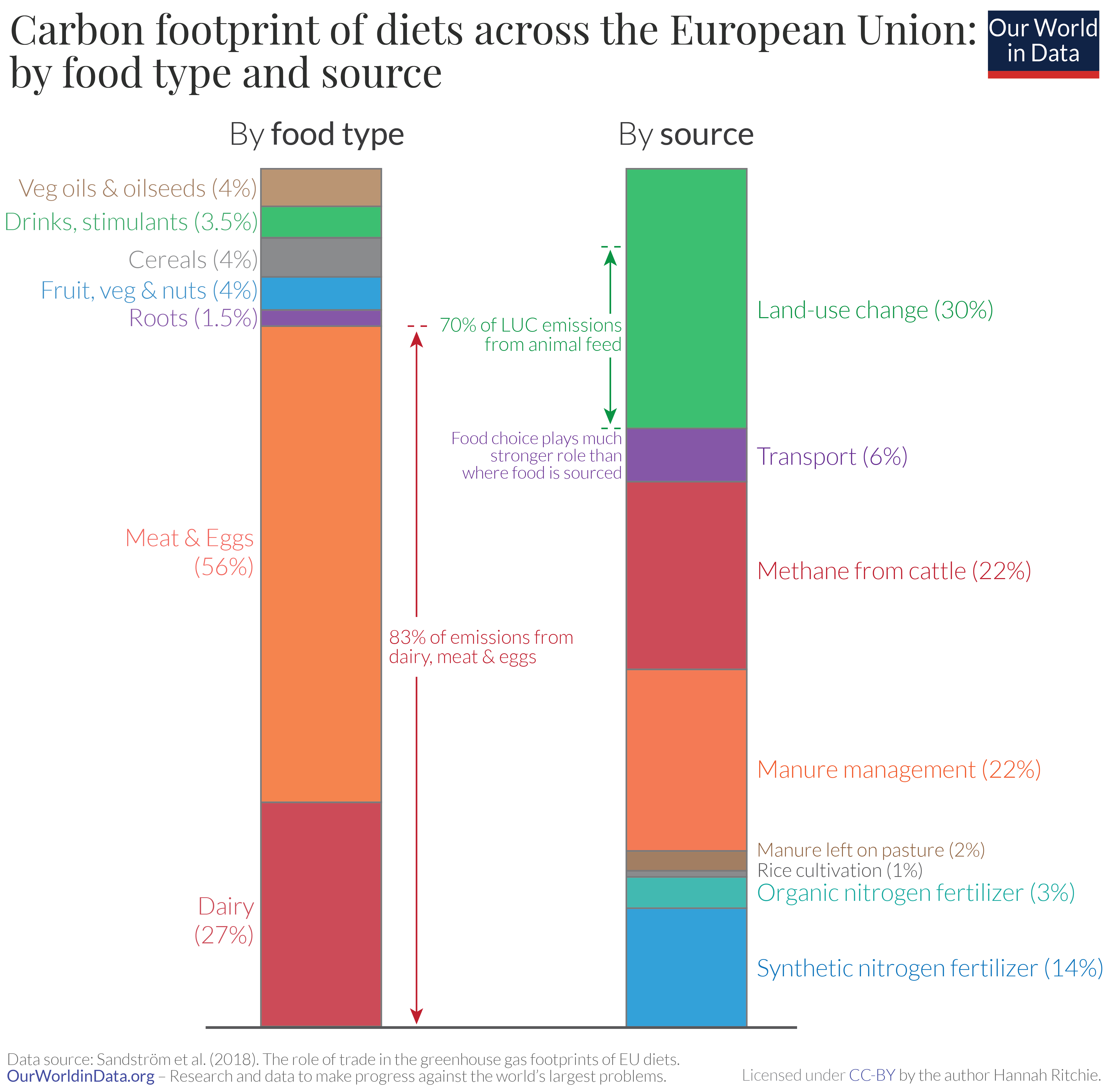
The carbon footprint of EU diets: where do emissions come from?
We’ve previously looked at the breakdown of carbon footprints for different food products. But our diets are made up of a wide range of foods – do these findings hold true when we look at realistic diets?
Let’s take a concrete example.
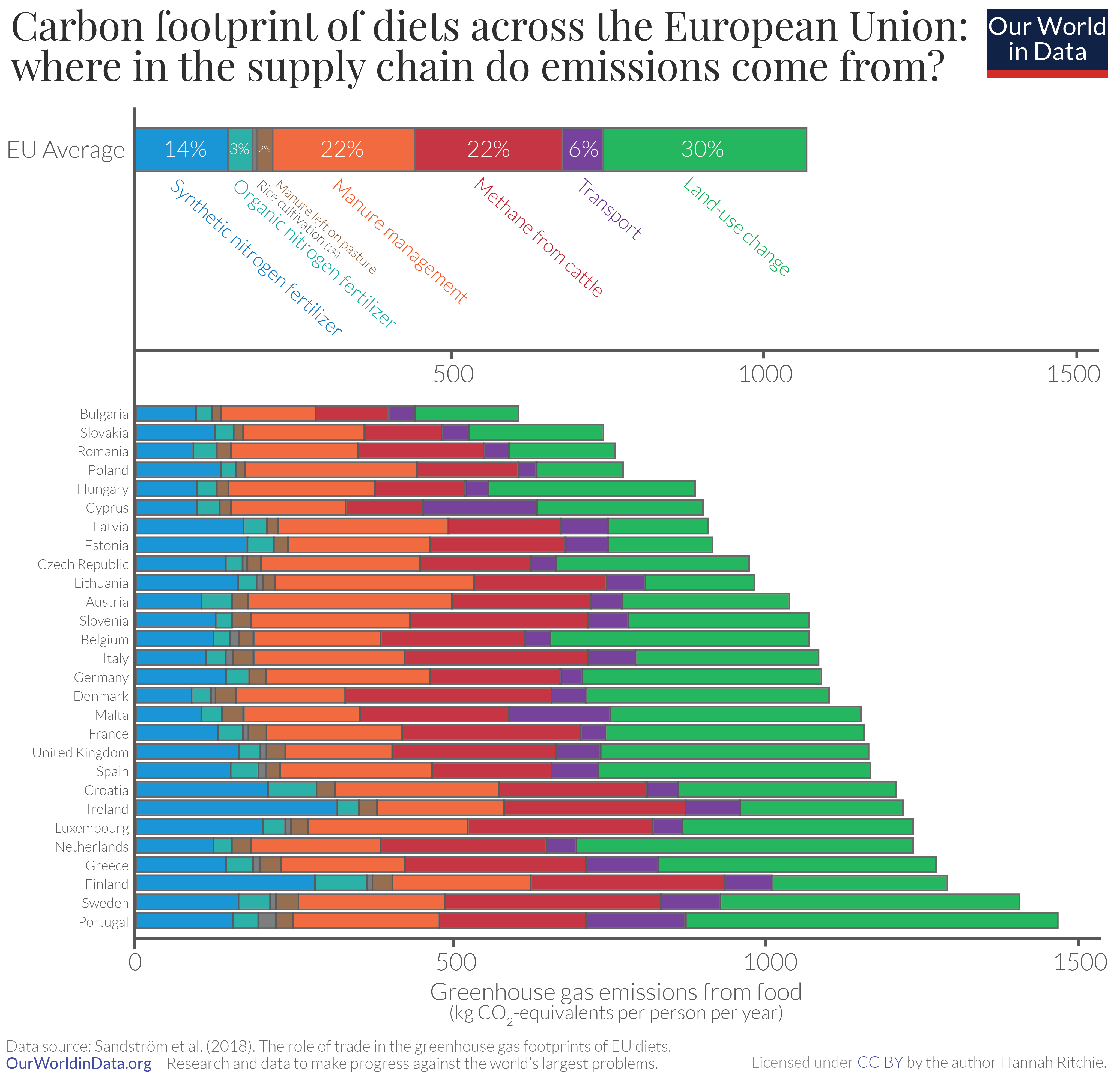
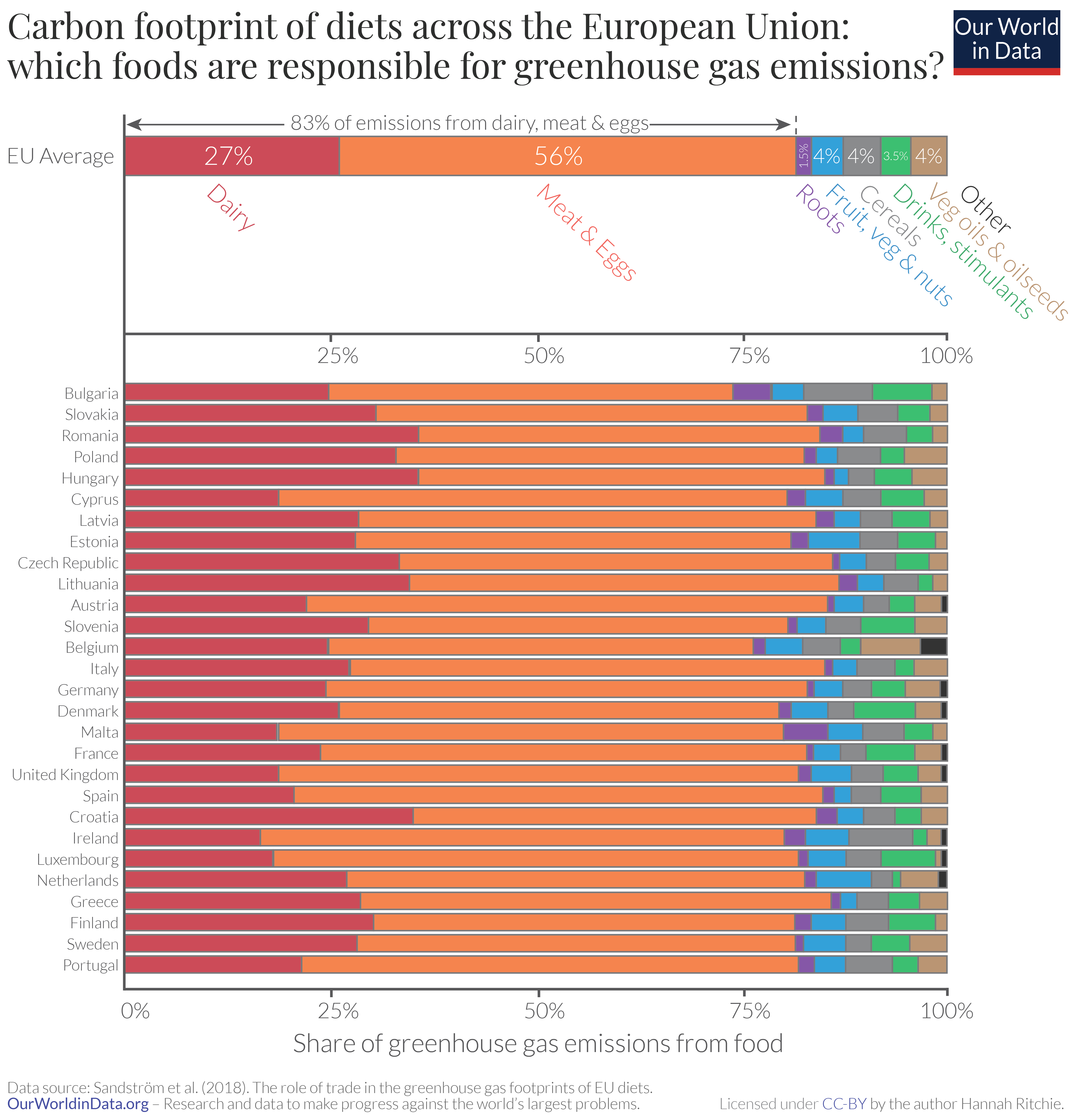
Vilma Sandström et al. (2018) compared greenhouse gas emissions from the average diet across countries in the European Union. In this study, the researchers quantified the emissions from food production, land-use change and trade (i.e. transport) for each food group.
In the two visualizations here we see comparisons of the carbon footprint of the average EU diets: firstly the total emissions from each source in the supply chain and secondly, shown as the breakdown by food item.
The conclusions we can draw from this are the same.
We see that the majority of emissions result from land use change, or emissions at the farm level – either methane emissions from cattle; management of manure; or use of fertilizer. Food transport accounted for only 6% of emissions.
When broken down by food items, dairy, meat and eggs dominate. They account for 83% of GHG emissions from the average EU diet. Only 17% results from plant-based foods. Most of the variation between countries comes from how much meat and dairy products they eat.
What Europeans ate has the biggest impact on their footprint. We see this clearly in this visualization when we look at the footprint of the average European diet by source and by food type side-by-side.
Unless you’ve cut it out completely, eating less meat and dairy products will have a much larger impact on your carbon footprint than eating locally. The climate benefits of eating locally are much smaller than people think.
Carbon footprint of food products
We have previously looked at the comparisons in carbon footprint of food products based on mass: the greenhouse gas emissions from one kilogram of food product.
But it’s also important to look at these comparisons in terms of nutritional units: this gives a measure of how low or high-impact different foods are in supplying protein or energy/calories, for example.
In the visualizations here we show the carbon footprint of foods as measured per 100 grams of protein, and per 1000 kilocalories. These charts are interactive so you can add and remove products using the ‘add food’ button.
Breakdown of where food system emissions come from
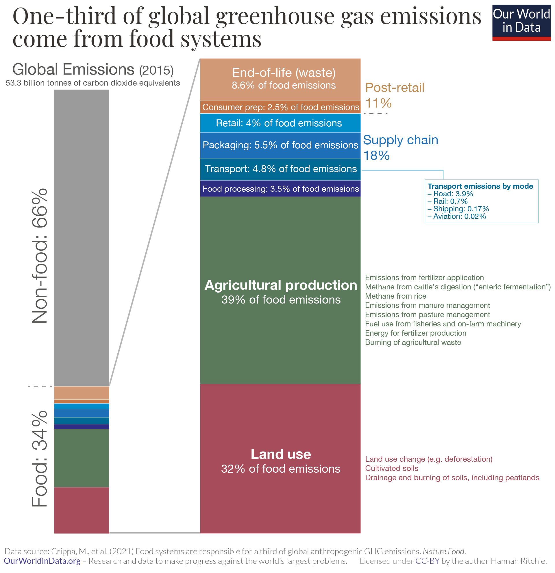
To see where (both by stage in the food chain and geographically) in the food system emissions come from, we can draw on the results of the study by Monica Crippa and colleagues, published in Nature Food.
This study adds a lot of value because it not only quantifies the breakdown of emissions by stages of the supply chain, it also provides a global perspective of each country’s contributions to food emissions. Its big drawback is that it does not provide a breakdown of emissions by product (e.g. how much of emissions come from cereals; beef; chicken; palm oil).
In the chart we see the breakdown of emissions from the food system. This was 34% of total greenhouse gas (GHG) emissions. The majority of emissions – over two-thirds – came from land use change and the on-farm production of the food itself. The remainder came from supply chain emissions and consumer cooking and waste.
Each stage of the supply chain – processing, transport, packaging and retail – accounted for a similar amount. Each was around 5% of food emissions. Transport was responsible for 4.8% of food emissions. Here we show this breakdown by road, rail, shipping and aviation. Most transport comes from local and regional trade in trucks; it accounts for 3.9% of food emissions. What’s surprising is the small fraction from aviation – just 0.02%. This is because very little of our food is flown. As I covered in a related article, the fact that not much of our food is flown means that the climate benefits of ‘eating local’ are much smaller than we perhaps might expect.
Which countries produce the most emissions from food?
There are large differences in food emissions across the world. This study allocates emissions to the countries where they are produced. This does not tell us the emissions of consumers within a given country. If Brazil cuts down its forests to produce beef that is exported to the United States, these emissions are allocated to Brazil. This is how countries report their emissions to the United Nations Framework Convention on Climate Change (UNFCCC) and how emissions targets are set. But it would also be useful to see emissions based on where they are consumed. After all, we know from our related work on deforestation and trade that some tropical deforestation is driven by demand by consumers in rich countries.
In the map we see the share of global food emissions that are produced in each country. The largest emitters are countries that we might expect, either because they have a large population size or are large agricultural producers. There are five countries which each contribute more than 5% to global emissions: China (13.8%); Indonesia (8.8%); United States (8.2%); Brazil (7.4%); and India (6.3%). There is then a large gap between the top five and the rest. Russia is next, but accounts for just 2.6%. [You can see each country’s emissions in absolute terms here].
It’s also interesting to see the differences in how much each country’s food emissions contribute to its total emissions. You find a global map of this here. We see a very strong rich-poor country divide. High-income countries tend to have energy-intensive industry or service-based economies. Food systems can contribute as little as 10% to total emissions. Lower income countries tend to have more agricultural-based economies. This means food systems account for a larger share of emissions of each of these countries. Food accounts for more than 80% of emissions in many countries across Sub-Saharan Africa, Latin America and Asia.
It’s useful for us to understand the global distribution of emissions from food production. But, as I mentioned, many of us are also interested in how much of a role we play as consumers. We want to know what our carbon footprint is, and how we can reduce it. An important next step for this work is to quantify food emissions based on where they are consumed.
If you are interested in how you can reduce the emissions from your diet, I cover this in my related work here.
Water Use
IN THIS SECTION
- Water footprint of food
- Scarcity-weighted water footprint of food
Water footprint of food
How do the water footprints of different food products compare? Which foods used the most and least freshwater in their production?
We can look at these comparisons based on mass: the freshwater withdrawals required to produce one kilogram of food product.
But it’s also important to look at these comparisons in terms of nutritional units: this gives a measure of how low or high-impact different foods are in supplying protein or energy/calories.
In the visualizations here we show the water footprint of foods, measured in liters (L) per kilogram, 100 grams of protein, and per 1000 kilocalories. These charts are interactive so you can add and remove products using the ‘add food’ button.
Scarcity-weighted water footprint of food
The water footprint of food products gives a useful indicator of their environmental impact. But freshwater scarcity varies across the world: some regions have abundant water resources (meaning agricultural water demands have little impact) whilst others experience severe water stress.
We can also look at water footprints in terms of scarcity-weighted freshwater use. Scarcity-weighted water use represents freshwater use weighted by local water scarcity.
How does the scarcity-weighted water footprint of different food products compare?
We can look at these comparisons based on mass: the scarcity-weighted water required to produce one kilogram of food product.
But it’s also important to look at these comparisons in terms of nutritional units: this gives a measure of how low or high-impact different foods are in supplying protein or energy/calories.
In the visualizations here we show the scarcity-weighted water footprint of foods, measured in liters (L) per kilogram, 100 grams of protein, and per 1000 kilocalories. These charts are interactive so you can add and remove products using the ‘add food’ button.
Eutrophication
IN THIS SECTION
- Eutrophying emissions from food
Eutrophying emissions from food
Eutrophication – the pollution of water bodies and ecosystems with excess nutrients – is a major environmental problem. The runoff of nitrogen and other nutrients from agricultural production systems is a leading contributor.
How do different food products contribute to eutrophication? We can compare these impacts by looking at eutrophying emissions – they represent runoff of excess nutrients into the surrounding environment and waterways, which affect and pollute ecosystems with nutrient imbalances. They are measured in kilograms of phosphate equivalents.
We can look at these comparisons based on mass: the eutrophying emissions from the production of one kilogram of food product.
But it’s also important to look at these comparisons in terms of nutritional units: this gives a measure of how low or high-impact different foods are in supplying protein or energy/calories.
In the visualizations here we show the eutrophying emissions of foods, measured in grams of phosphate equivalents (gPO₄eq) per kilogram, 100 grams of protein, and per 1000 kilocalories. These charts are interactive so you can add and remove products using the ‘add food’ button.
Food miles
IN THIS SECTION
- Most food travels by sea, not by air
- Whether food travels by sea or air makes all the difference
Very little of global food is transported by air; this greatly reduces the climate benefits of eating local
People often think that eating ‘local’ – buying foods which are produced close to home – is one of the most effective ways to reduce our carbon footprint.
This is certainly true for foods that are transported by plane. But the reality is that very little of our food is.
Most food travels by sea, not by air
One simple way to compare the means of transport for food is to sum up how many kilometers planes with food freight travel; and compare this to how how many kilometers trains, and ships, and trucks do.
But this does not give the complete picture because a boat can carry much more food for a given distance than a truck can. To give an informative comparison, we use a metric called ‘food miles’; this is calculated as the distance each transport method covers multiplied by the quantity of food transported (by mass). This gives us a comparison of food miles in tonne-kilometers.
The chart here shows the share of global ‘food miles’ by transport method. This data is sourced from the work of Joseph Poore and Thomas Nemecek, published in the journal Science in 2018.
As the data here shows, only 0.16% of food miles come from air travel. Most – nearly 60% – comes by boat.
You can see this data in absolute terms, in tonne-kilometers, here.
Whether food travels by sea or air makes all the difference
Transporting food by air emits around 50 times as much greenhouse gases as transporting the same amount by sea. More specifically, 0.023 kilograms of carbon dioxide-equivalents (CO2eq) per tonne-kilometer by sea, versus 1.13 kilograms CO2eq by air. We see these emission factors for different transport modes in the table.
For food that is transported by sea, transportation doesn’t actually add much to the carbon footprint. Since most of our food is transported by sea, transport emissions only account for 6% of the carbon footprint of food, on average.41
But for those food items that travel by air, travel distance does have a large impact. We should avoid air-freighted goods where we can.
Which foods are air-freighted? How do we know which products to avoid?
Foods which are air-freighted tend to be those which are highly perishable. This means they need to be eaten soon after they’ve been harvested. In this case, transport by boat is too slow, leaving air travel as the only feasible option.
Some fruit and vegetables tend to fall into this category. Asparagus, green beans and berries are common examples of air-freighted goods.
It is often hard for consumers to identify foods that have travelled by air, since they’re rarely labeled as such. This makes them hard to avoid. A general rule is to avoid foods that have a very short shelf-life and have traveled a long way (many labels have the country of ‘origin’ which helps with this). This is especially true for foods where there is a strong emphasis on ‘freshness’: for these products, transport speed is a priority.
Emission factors for freight by transport mode (kilograms of CO2eq per tonne-kilometer)
| Transport mode | Ambient transport (kg CO2eq per tonne-kilometer) | Temperature-controlled transport (kg CO2eq per tonne-kilometer) |
|---|---|---|
| Road Transport | 0.2 | 0.2 to 0.66 |
| Rail Transport | 0.05 | 0.06 |
| Sea / Inland Water Transport | 0.01 | 0.02 |
| Air Transport | 1.13 | 1.13 |
Example: how does the footprint of vegetables change if they travel across the world by plane vs. boat?
Let’s take the example of asparagus.
If you live in the UK, you may have noticed on food labels that asparagus is often imported from Peru. They often come by plane. How does this affect their carbon footprint?
The average carbon footprint of asparagus is around 0.4 kilograms CO2eq per kilogram. Flying from Lima to London is around 10,000 kilometers. If we were to fly one kilogram of asparagus over this distance, this would emit around 11 kilograms of CO2eq [10,000km * 1.13 kilograms CO2eq per tonne-kilometer for flying / 1000 = 11.3 kg CO2eq per kg]. Suddenly the footprint of your asparagus changes from being a low-carbon food to a relatively high-carbon one, at almost 12 kg CO2eq per kg. It has a higher carbon footprint that a kilogram of chicken or pork.
It is the fact that it’s flown, rather than the travel distance itself that gives asparagus a large footprint in this example. If it traveled the same distance by boat, the travel emissions would be only 0.26 kg CO2eq per kg [10,000km * 0.026 kilograms CO2eq per tonne-kilometer for transport by boat / 1000 = 0.26 kg CO2eq per kg]. So its total footprint would be around 0.67 kg CO2eq per kg, which still makes it a low-carbon food option.
Food waste
IN THIS SECTION
- Food waste is responsible for 6% of global greenhouse gas emissions
Food waste is responsible for 6% of global greenhouse gas emissions
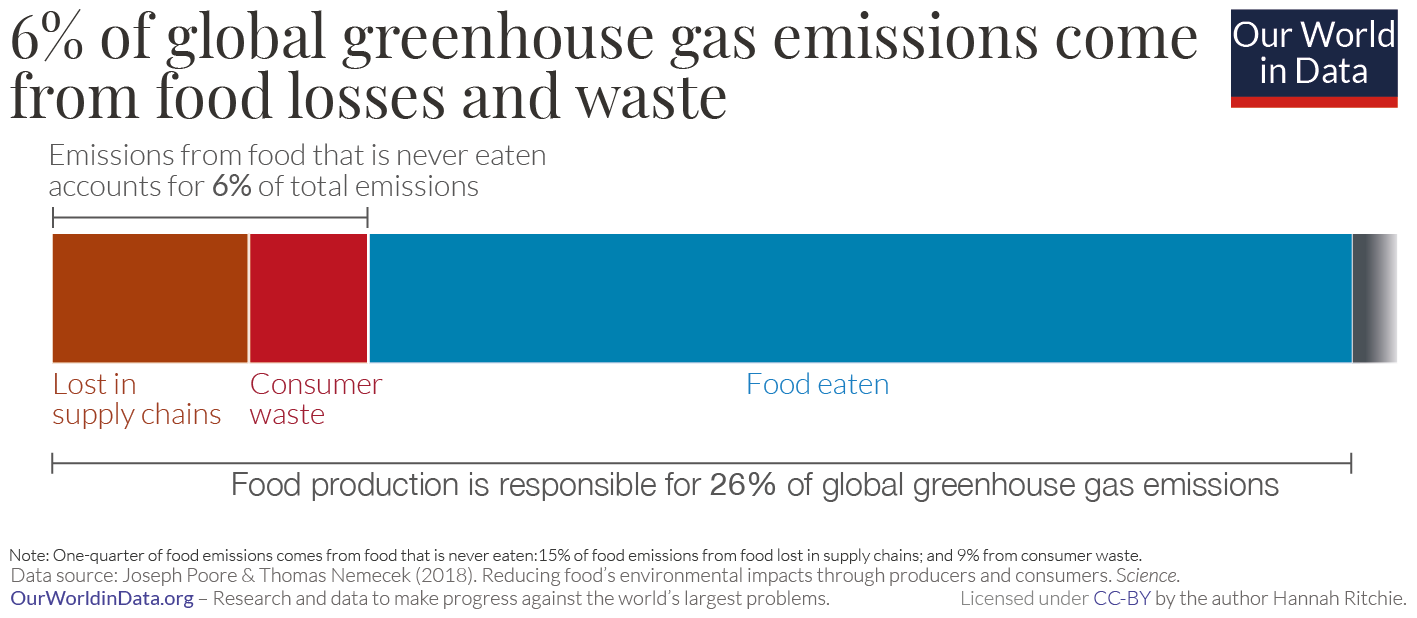
Food production accounts for around one-quarter – 26% – of global greenhouse gas emissions. This is a lot, but it’s slightly easier to digest when we remind ourselves that food is a basic human need.
What’s harder to make sense of is the amount of greenhouse gas emissions which are caused in the production of food that is never eaten.
Around one-quarter of the calories the world produces are thrown away; they’re spoiled or spilled in supply chains; or are wasted by retailers, restaurants and consumers. To produce this food we need land, water, energy, and fertilizer inputs. It all comes at an environmental cost.
Joseph Poore and Thomas Nemecek (2018), in their large meta-analysis of global food systems, published in Science, estimated how much of our greenhouse gas emissions come from wasted food.
In the visualization here I show the emissions from wasted food in the context of global greenhouse gas emissions.
The study by Poore and Nemecek (2018) found that almost one-quarter – 24% – of food’s emissions come from food that is lost in supply chains or wasted by consumers. Almost two-thirds of this (15% of food emissions) comes from losses in the supply chain which result from poor storage and handling techniques; lack of refrigeration; and spoilage in transport and processing. The other 9% comes from food thrown away by retailers and consumers.
This means that food wastage is responsible for around 6% of total global greenhouse gas emissions.46 In fact, it’s likely to be slightly higher since the analysis from Poore and Nemecek (2018) does not include food losses on the farm during production and harvesting.
To put this in context: it’s around three times the global emissions from aviation.47 Or, if we were to put it in the context of national emissions, it would be the world’s third largest emitter.48 Only China (21%) and the United States (13%) emitted more.49