
For most of human history our ancestors relied on very basic forms of energy: human muscle, animal muscle and the burning of biomass such as wood or crops. But the Industrial Revolution unlocked a whole new energy resource: fossil fuels. Fossil energy has been a fundamental driver of the technological, social, economic and development progress which has followed.
Fossil fuels (coal, oil, gas) have, and continue to, play a dominant role in global energy systems.
But they also come with several negative impacts. When burned they produce carbon dioxide (CO2) and are the largest driver of global climate change. They are also a major contributor to local air pollution, which is estimated to be linked to millions of premature deaths each year.
As low-carbon sources of energy – nuclear and renewables – become readily available, the world needs to rapidly transition away from fossil fuels.
This article presents the long-run and recent perspectives on coal, oil and gas – how much countries produce and consume; where our fossil fuel reserves are; and what role the fuels play in our energy and electricity systems.
All our charts on Fossil Fuels
- Air pollution deaths from fossil fuels
- Annual CO₂ emissions
- Annual CO₂ emissions from coal
- Annual CO₂ emissions from gas
- Annual CO₂ emissions from oil
- Annual change in coal energy consumption
- Annual change in fossil fuel consumption
- Annual change in gas consumption
- Annual change in oil consumption
- Annual percentage change in coal energy consumption
- Annual percentage change in fossil fuel consumption
- Annual percentage change in gas consumption
- Annual percentage change in oil consumption
- CO2 emissions by fuel
- Carbon Dioxide Emissions Factor, kg CO₂ per MWh
- Coal by end user in the United Kingdom
- Coal consumption
- Coal consumption by region
- Coal output from opencast and deepmines in the United Kingdom
- Coal output per worker in the United Kingdom
- Coal prices
- Coal production
- Coal production and imports in the United KingdomTerrawatt-hours
- Coal production and imports in the United KingdomTonnes
- Coal production by region
- Coal production per capita
- Coal production per capita over the long-term
- Coal reserves
- Coal reserves by type
- Crude oil prices
- Crude oil spot prices
- Electricity generation from coal
- Electricity generation from fossil fuels
- Electricity generation from gas
- Electricity generation from low-carbon sources
- Electricity generation from oil
- Employment in the coal industry in the United Kingdom
- Fossil fuel consumption
- Fossil fuel consumption by fuel type
- Fossil fuel consumption per capita
- Fossil fuel consumption per capita
- Fossil fuel consumption per capita
- Fossil fuel price index
- Fossil fuel production
- Fossil fuel production over the long-term
- Fossil fuel production per capita
- Fossil-fuel subsidies as a share of GDP
- Fossil-fuel subsidies
- Fossil-fuel subsidies per capita
- GDP per capita vs. Energy use
- Gas Reserves
- Gas consumption
- Gas consumption by region
- Gas production
- Global carbon budget for a two-degree world
- Global fossil fuel consumption
- Hubbert's peak prediction vs. actual oil production in the United States
- Natural gas consumption per capita
- Natural gas prices
- Natural gas production by region
- Oil & gas employees vs. rig count in the United States
- Oil consumption
- Oil consumption by region
- Oil consumption per capita
- Oil production
- Oil production by region
- Oil production per capita
- Per capita CO2 emissions by fuel type
- Per capita CO2 emissions from coal
- Per capita CO2 emissions from gas
- Per capita CO2 emissions from oil
- Per capita energy consumption from coal
- Per capita energy consumption from coal
- Per capita fossil energy consumption vs. GDP per capita
- Per capita gas consumption
- Per capita oil consumption
- Pump price for diesel fuel (US$ per liter)
- Pump price for gasoline (US$ per liter)
- Share of electricity production from coal
- Share of electricity production from fossil fuels
- Share of electricity production from gas
- Share of electricity production from oil
- Share of primary energy from coal
- Share of primary energy from fossil fuels
- Share of primary energy from gas
- Share of primary energy from oil
- Share of the workforce employed in the coal industry, United Kingdom
- Total natural resources rents (% of GDP)
- World crude oil price vs. oil consumption
- Years of fossil fuel reserves left
Fossil fuel consumption
IN THIS SECTION
- Global fossil fuel consumption
- Fossil fuel consumption: which countries use the most energy from fossil fuels?
- Per capita: where do people consume the most energy from fossil fuels?
- Fossil fuel consumption by type
Global fossil fuel consumption
The burning of fossil fuels for energy began around the onset of the Industrial Revolution. But fossil fuel consumption has changed significantly over the past few centuries – both in terms of what and how much we burn.
In the interactive chart we see global fossil fuel consumption broken down by coal, oil and gas since 1800. Earlier data, pre-1965, is sourced from Vaclav Smil’s work on energy transitions; this has been combined with data published in BP’s Statistical Review of World Energy from 1965 onwards.1
Fossil fuel consumption has increased significantly over the past half-century, around eight-fold since 1950, and roughly doubling since 1980.
But the types of fuel we rely on has also shifted, from solely coal towards a combination with oil, and then gas. Today, coal consumption is falling in many parts of the world. But oil and gas are still growing quickly.
Fossil fuel consumption: which countries use the most energy from fossil fuels?
Related charts:

How is fossil fuel consumption changing from year-to-year in absolute terms?Annual percentage change in fossil fuel consumption

How is fossil fuel consumption changing from year-to-year in absolute terms?Annual change in fossil fuel consumption
We’ve looked at how much fossil fuel energy is consumed globally. But what about countries? How much fossil energy do they consume?
The interactive chart here shows the amount of primary energy from fossil fuels that is consumed each year.
This is the sum of energy from coal, oil and gas. In the sections below we look at each of these sources individually.
Three tips on how to interact with this map
- By clicking on any country on the map you see the change over time in this country.
- By moving the time slider (below the map) you can see how the global situation has changed over time.
- You can focus on a particular world region using the dropdown menu to the top-right of the map.
Per capita: where do people consume the most energy from fossil fuels?
Related chart:

How much coal, oil and gas energy is consumed per person? Fossil fuel per capita by type

Do we consume more or less energy from fossil fuels as we get richer? Explore the data on how fossil fuels relate to income.Per capita fossil fuel consumption vs. GDP
Looking at energy consumption at the country level is often a strong reflection of population size rather than actual fossil fuel consumption per person.
How do these comparisons look when we adjust for population?
In the interactive chart we see the amount of energy from fossil fuels consumed per person. This is the sum of primary energy from coal, oil and gas combined.
Across the world we see that the largest consumers use more than ten times the amount of fossil energy than some of the smallest consumers.
Four tips on how you can interact with this chart
- Change the bar chart into a line chart: by clicking on the timeline at the bottom of the chart you can change the bar chart into a line chart.
- See the change over time: Using the ‘play’ button on the timeline you can see how this metric changes over time.
- Add any other country: click on the Add country button to compare with any other country.
- See the data on a world map: click on the ‘MAP’ tab to see the global overview across countries.
Fossil fuel consumption by type
In the sections above we looked at the consumption of fossil fuels collectively. But it’s important to look at the role of coal, oil and gas individually – their impacts are not equal. Coal, for example, typically produces more CO2 and local air pollution per unit of energy [see our article on the relative safety and impacts of different energy sources].
In the interactive charts here we fossil fuel consumption disaggregated by type. This is shown as a stacked area chart – useful for seeing the relative contribution of each; but also as a line chart which allows us to see how the consumption of each is changing over time.
How you can interact with the stacked area chart
- In these charts it is always possible to switch to any other country in the world by choosing Change Country in the bottom left corner.
- By unticking the ‘Relative’ box, you can switch to see the breakdown of emissions in absolute terms.
Fossil fuels in the energy and electricity mix
IN THIS SECTION
- What share of primary energy comes from fossil fuels?
- What share of electricity comes from fossil fuels?
What share of primary energy comes from fossil fuels?
Related content:

What sources does our energy come from? Explore our work on the energy mix across the world. Energy mix
How do fossil fuels fit in within the rest of the energy mix? What share of primary energy comes from fossil fuels?
In 2019, around 84% of global primary energy came from coal, oil and gas. Over the coming decades we need to rapidly reduce this share by displacing them with low-carbon energy sources.
In the interactive chart we see how this share varies across the world.
What share of electricity comes from fossil fuels?
A few points to keep in mind when considering this data:
- These figures reflect energy consumption – that is the sum of all energy uses including electricity, transport and heating. Many people assume energy and electricity to mean the same, but electricity is just one component of total energy consumption. We look at electricity consumption later in this profile.
- These figures are based on primary energy consumption – given by the ‘substitution method’. You can read our explainer on the different metrics used to measure energy here.
Two tips on how you can interact with this chart
- View the data for any country as a line chart: click on any country to see its change over time, or by using the ‘CHART’ tab at the bottom.
- Add any other country to the line chart: click on the Add country button to compare with any other country.
What share of electricity comes from fossil fuels?
Related content:

What sources does our electricity come from? Explore our work on the electricity mix across the world. Electricity mix
Electricity is one component of total energy consumption – the other two being transport and heating.
Globally, fossil fuels account for a much smaller share of electricity production than the energy system as a whole. In 2019, around 64% of our electricity came from fossil fuels.
This interactive map shows the share of electricity that comes from fossil fuels (coal, oil and gas summed together) across the world. Oil accounts for only a small share of electricity production – most come from coal and gas. The share from coal and gas individually can be found in the sections below.
Coal
IN THIS SECTION
- Coal production: how much do countries produce?
- Energy from coal: how much do countries consume?
- What share of primary energy comes from coal?
- What share of electricity comes from coal?
Coal production: how much do countries produce?
Related charts:

How much coal do countries produce per person?Coal production per capita

Which regions produce the most coal?Coal production by region
Which countries produce the most coal? How has this changed over time?
In the interactive chart here we see coal production by country. This has been converted into primary energy equivalents (i.e. terawatt-hours of energy) for comparability across our other data on energy.
Note that this measures coal production, not consumption. Many countries consume energy from coal in their energy supply. But not all countries have coal reserves to produce this themselves. This therefore measures coal production before trade between countries.
Energy from coal: how much do countries consume?
Related charts:

Which countries consume the most coal per person? Per capita consumption of energy from coal

How is coal energy consumption changing from year-to-year in absolute terms?Annual change in coal energy consumption

How is coal energy consumption changing from year-to-year in percentage terms?Annual percentage change in coal energy consumption

Which regions consume the most coal? Coal consumption by region
Fossil fuel production is an important metric to follow – it helps us understand where fossil fuels are being extracted. But we also care about where that energy is being consumed – that tells us what role fossil fuels are playing in the energy system of each country.
This interactive chart shows primary energy consumption from coal across the world. This represents coal production adjusted for trade (so, coal exports are subtracted and imports are added).
What share of primary energy comes from coal?
Coal has been a critical energy source and mainstay in global energy production for centuries.
But it’s also the most polluting energy source: both in terms of the amount of CO2 it produces per unit of energy, but also the amount of local air pollution it creates. Moving away from coal energy is important for climate change as well as human health.
This interactive map shows the share of primary energy that comes from coal across the world.
What share of electricity comes from coal?
Coal is currently the largest source of electricity globally. For many countries remains the dominant source. But, we also see that others have seen a massive shift away from coal in recent years – the UK is one such example.
This interactive map shows the share of electricity that comes from coal across the world.
Oil
IN THIS SECTION
- Oil production: how much do countries produce?
- Energy from oil: how much do countries consume?
- What share of primary energy comes from oil?
Oil production: how much do countries produce?
Which countries produce the most oil? How has this changed over time?
In the interactive chart here we see oil production by country. This has been converted into primary energy equivalents (i.e. terawatt-hours of energy) for comparability across our other data on energy.
Note that this measures oil production, not consumption. Many countries consume energy from oil in their energy supply. But not all countries have oil reserves to produce this themselves. This, therefore, measures oil production before trade between countries.
Energy from oil: how much do countries consume?
Related charts:

Which countries consume the most oil per person?Per capita consumption of energy from oil

How is oil energy consumption changing from year-to-year in absolute terms?Annual change in oil energy consumption

How is oil energy consumption changing from year-to-year in percentage terms?Annual percentage change in oil energy consumption

Which regions consume the most oil? Oil consumption by region
Oil production is an important indicator to follow – it helps us understand where it’s being extracted, who the main oil producers are, and how this is related to oil reserves. But we also care about where that oil is being consumed – that tells us what role it’s playing in the energy system of each country.
This interactive chart shows primary energy consumption from oil across the world. This represents oil production adjusted for trade (so, oil exports are subtracted and imports are added).
What share of primary energy comes from oil?
Oil is the world’s largest energy source today. It is the dominant source of energy for the transport sector in particular.
This interactive map shows the share of primary energy that comes from oil across the world.
Gas
IN THIS SECTION
- Gas production: how much do countries produce?
- Energy from gas: how much do countries consume?
- What share of primary energy comes from gas?
- What share of electricity comes from gas?
Gas production: how much do countries produce?
Related charts:

How much gas do countries produce per person? Gas production per capita

Which regions produce the most natural gas? Gas production by region
Which countries produce the most gas? How has this changed over time?
In the interactive chart here we see gas production by country. This has been converted into primary energy equivalents (i.e. terawatt-hours of energy) for comparability across our other data on energy.
Note that this measures gas production, not consumption. Many countries consume energy from gas in their energy supply. But not all countries have gas reserves to produce this themselves. This, therefore, measures gas production before trade between countries.
Energy from gas: how much do countries consume?
Related charts:

Which countries consume the most gas per person? Per capita consumption of energy from gas

How is gas consumption changing from year-to-year in absolute terms?Annual change in gas energy consumption

How is gas consumption changing from year-to-year in percentage terms?Annual percentage change in gas energy consumption

Which regions consume the most natural gas? Gas consumption by region
In the section above we looked at where in the world gas is produced. But, after trade, where in the world is gas consumed?
This interactive chart shows primary energy consumption from gas across the world. This represents gas production adjusted for trade (so, gas exports are subtracted and imports are added).
What share of primary energy comes from gas?
Natural gas has, for decades, lagged behind coal and oil as an energy source. But today its consumption is growing rapidly – often as a replacement for coal in the energy mix. Gas is a major provider of electricity production, and a key source of heat.
This interactive map shows the share of primary energy that comes from gas across the world.
What share of electricity comes from gas?
Gas is now the second-largest source of electricity production globally.
Its contribution is growing quickly in many countries as they substitute it for coal in the electricity mix. From a climate perspective, this transition is positive since gas typically emits less CO2 per unit of energy. But, we still ultimately want to shift away from gas towards low-carbon sources such as renewables and nuclear.
This interactive map shows the share of electricity that comes from gas across the world.
This interactive map shows the share of electricity that comes from gas across the world.
Fossil fuel reserves
IN THIS SECTION
Coal reserves
Related chart:

Coal sources are not homogeneous – they vary significantly in chemical composition and quality. How do coal reserves break down by quality? Coal reserves by quality/type
In previous sections, we looked at how much fossil fuels different countries produced or consumed. But where in the world do our existing reserves of fossil fuels remain?
Which countries have the potential to extract and sell them?
In the interactive chart, we see prove of coal reserves across the world.
It’s important to distinguish reserves versus resources here. “Proved reserves” represents coal that we know with reasonable certainty could be recovered in the future under existing economic and technological operating conditions. In other words, we know it’s there and it would be technologically and economically feasibly to extract it.
Reserves represent only some fraction of resources, however; we continue to discover new quantities of coal, and with time more becomes technologically feasible to extract. This means our quantity of reserves changes all the time – not only based on how much we consume but by how many new resources are ‘unlocked’.
We look at the difference between reserves and resources in more detail here.
Gas reserves
Where in the world do we have gas reserves? Which countries have the ability to extract, consume and trade?
In the interactive chart, we see proven gas reserves across the world.
It’s important to distinguish reserves versus resources here. “Proved reserves” represents coal that we know with reasonable certainty could be recovered in the future under existing economic and technological operating conditions. In other words, we know it’s there and it would be technologically and economically feasibly to extract it.
Reserves represent only some fraction of resources, however; we continue to discover new quantities of gas, and with time more becomes technologically feasible to extract. This means our quantity of reserves changes all the time – not only based on how much we consume but by how many new resources are ‘unlocked’.
We look at the difference between reserves and resources in more detail here.
When will the world run out of fossil fuels?
Fossil fuels (coal, oil and gas) are finite — consume them for long enough and global resources will eventually run out. Concerns surrounding this risk have persisted for decades. Arguably the most well-known example of this was Hubbert’s Peak Theory — also known as the Hubbert curve.
M. King Hubbert, in 1956, published his hypothesis that for any given region, a fossil fuel production curve would follow a bell-shaped curve, with production first increasing following the discovery of new resources and improved extraction methods, peaking, then ultimately declining as resources became depleted.2
His prediction that the United States would peak in oil production in 1970 actually came true (although it peaked 17 percent higher than he projected, and its pathway since has not followed the bell-shaped curve he predicted). This is shown in the chart with Hubbert’s hypothesized peak shown alongside actual US production data reported by the Energy Information Administration (EIA); both are measured in barrels produced per year.3
Many have attempted to apply Hubbert’s theory at not only a regional but also a global level to answer the question: When will we run out of fossil fuels?4
Most attempts have, however, been proven wrong. During the 1979 oil crisis, Hubbert himself incorrectly predicted the world would reach ‘peak oil’ around the year 2000; and in the decades since, this prediction has been followed by a succession of premature forecasts by analysts.5
Meanwhile, actual global oil production and consumption continue to rise.
The difficulty in attempting to construct these curves is that our discovery of reserves and technological potential to extract these reserves economically evolves with time. If we look at trends in proven fuel reserves, we see that our reported oil reserves have not decreased but increased by more than 50 percent, and natural gas by more than 55 percent, since 1995. This fact, combined with changes in rates of consumption means that predicting ‘peak fossil fuel’ is highly uncertain.6
To give a static indicative estimate of how long we could feasibly consume fossil fuels for, we have plotted the Reserves-to-Production (R/P) ratio for coal, oil and gas based on 2015 figures. The R/P ratio essentially divides the number of known fuel reserves by the current rate of production to estimate how long we could continue if this level of production remained constant. Based on BP’s Statistical Review of World Energy 2016, we’d have about 115 years of coal production, and roughly 50 years of both oil and natural gas remaining.7
Again, these figures are only useful as a static measure; they will continue to vary with time as our capacity to economically source and extract fossil fuels changes and our levels of consumption rising or falling.
However, whilst depleting reserves could become a pressing issue 50-100 years from now, there is another important limit to fossil fuel production: climate change. Carbon dioxide emissions remain trapped in the atmosphere for long periods of time, building up an atmospheric stock that leads temperatures to rise. To keep the average global temperature increase below two degrees celsius (as has been agreed in the UN Paris Agreement), we can thus calculate the cumulative amount of carbon dioxide we can emit while maintaining a probability of remaining below this target temperature. This is what we define as a ‘carbon budget’. In the latest Intergovernmental Panel on Climate Change (IPCC) report, the budget for having a 50 percent chance of keeping average warming below two degrees celsius was estimated to be approximately 275 billion tonnes of carbon (as shown in the chart).8
Note that with each year that passes, the remaining carbon budget continues to decline—by the end of 2017, this figure will have further decreased from the IPCC’s estimates.
Here’s the crucial factor: if the world burned all of its currently known reserves (without the use of carbon capture and storage technology), we would emit a total of nearly 750 billion tonnes of carbon. This means that we have to leave around two-thirds of known reserves in the ground if we want to meet our global climate targets. However, it is important to keep in mind that this in itself is a simplification of the global ‘carbon budget’. As discussed in detail by CICERO’s Glen Peters, there is actually a variety of possible carbon budgets, and their size depends on a number of factors such as: the probability of staying below our two-degree warming target, the rates of decarbonization, and the contribution of non-CO2 greenhouse gases. For example, if we wanted to increase the probability of keeping warming below two degrees celsius to 80 percent, we would need stricter carbon limits, and would have to leave 75-80 percent of fossil fuels untouched.9
The quantity of fossil fuels which we would have to abandon is often referred to as ‘unburnable carbon. According to a widely-quoted study by Carbon Tracker, there is significant potential for this unburnable carbon to result in major economic losses.10
If capital investment in carbon-emitting infrastructure continues at recent rates, it estimates that up to 6.74 trillion US$ (nearly twice the GDP of Germany in 2016) would be wasted over the next decade in the development of reserves that will eventually be unburnable. The study defines this as ‘stranded assets'.
So whilst many worry about the possibility of fossil fuels running out, it is instead expected that we will have to leave between 65 to 80 percent of current known reserves untouched if we are to stand a chance of keeping average global temperature rise below our two-degrees global target.
CO2 emissions from fossil fuels
Three-quarters of global greenhouse gas emissions come from energy production. To stand a chance of meeting our climate change targets, we must rapidly reduce CO2 emissions from fossil fuels.
Explore our related work on CO2 emissions – where they come from and how they are changing over time.
Definitions & Measurement
Reserves vs. Resources: When does a resource become a reserve?
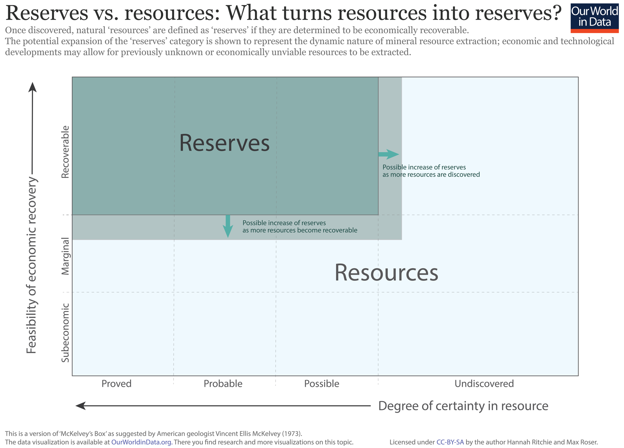
The terms ‘reserves’ and ‘resources’ are often used interchangeably. However, there is an important distinction between the two. The chart explains this distinction visually.
It is true that every reserve is a resource, but not every resource is a reserve. There are two requirements that determine whether a mineral resource becomes a reserve. The first is the degree of certainty that it exists: the planet likely has many mineral resources which we have not yet discovered. So to be defined as a reserve, we must have either a proven, probable or possible understanding of its existence. The second criteria relate to the economic feasibility of being able to access and extract the mineral resource. To be defined as a reserve, it must be economically and technologically viable to recover. If the economics are subeconomic (i.e. would result in a net loss) or marginal, a mineral resource is not defined as a reserve.
Whilst the original source of this concept – the American geologist Vincent McKelvey – visualized it as a static box, this transition between resources and reserve classifications is dynamic. As we discover previously unknown resources, and develop improved extraction technologies for economic recovery, this reserves box can grow with time (or shrink as we consume them).
Units of energy
To maintain consistency between metrics and sources, we have attempted to normalize all energy data to units of watt-hours (Wh), or one of its SI prefixes. The table shows the conversion of watt-hours to the range of SI prefixes used.
| SI Unit | Watt-hour (Wh) equivalent |
| Watt-hour (Wh) | – |
| Kilowatt-hour (kWh) | One thousand watt-hours (103 Wh) |
| Megawatt-hour (MWh) | One million watt-hours (106 Wh) |
| Gigawatt-hour (GWh) | One billion watt-hours (109 Wh) |
| Terawatt-hour (TWh) | One trillion watt-hours (1012 Wh) |
Data Sources
BP Statistical Review of World Energy
- Data: BP publishes data on Oil, Gas Coal, Nuclear Energy, Hydroelectricity, Renewables, Primary Energy Consumption, Electricity Generation, Carbon Doixide Emissions
- Geographical coverage: Global – by country and region
- Time span: Annual data since 1951
- Available at: Online at www.BP.com
The Shift Project (TSP)
- Data: Historical Energy Consumption Statistics and Historical Energy Production Statistics
- Geographical coverage: Global – by country and world region
- Timespan: Since 1900
- Available at: Both datasets are online at www.tsp-data-portal.org.
IEA – International Energy Agency
- Data: Data on electricity, oil, gas, coal and renewables. Data on CO2 emissions (also projections)
- Geographical coverage: Global – by country
- Timespan: Last decades
- Available at: Online at www.iea.org
- The IEA is publishing the World Energy Outlook.
- You have to pay to access the IEA databases. But some data is available through Gapminder, for example, Residential Energy Use (%). (for few countries since 1960, for more countries since 1971 or 1981)
Energy Information Administration
- Data: Total and crude oil production, oil consumption, natural gas production and consumption, coal production and consumption, electricity generation and consumption, primary energy, energy intensity, CO2 emissions and imports and exports for all fuels
- Geographical coverage: Global – by country
- Timespan: Annual data since 1980
- Available at: Online at ww.eia.gov
- EIA is a US government agency.
World Development Indicators – World Bank
- Geographical coverage: Global – by country and world region
- Timespan: Last decades
- Data: Energy use (kt of oil equivalent) – Energy use (kg of oil equivalent per capita) – Energy production (kt of oil equivalent)
- Many more related indicators.
Eurostat
- Data: Production & consumption of energy.
- Geographical coverage: Europe
- Timespan:
- Data on: Energy production and imports – Consumption of energy – Electricity production, consumption and markets.