
CO2 and Greenhouse Gas Emissions Country Profiles
How are emissions changing in each country? Is your country making progress on reducing emissions? We built 207 country profiles which allow you to explore the statistics for every country in the world.
Each profile includes interactive visualizations, explanations of the presented metrics, and the details on the sources of the data.
See emissions in your country and how it compares to others:
Our 12 most visited country profiles
Every profile includes five sections
- CO2 emissions: How much does a country emit each year? What is the average emissions per person? How much has it emitted over time? How do emissions compare when we correct for trade?
- Coal, oil, gas, cement: How much CO2 comes from coal, oil, gas, flaring or cement production?
- Other greenhouse gases: How much total greenhouse gases does each country emit? How much methane, and nitrous oxide is emitted?
- Emissions by sector: Which sectors contribute most to emissions? Does transport contribute more or less than electricity; how large are agriculture and land use emissions?
- Carbon and energy efficiency: How much energy do we use per unit of GDP? How much carbon do we emit per unit of energy?
Why do greenhouse gas emissions matter?
Global average temperatures have increased by more than 1℃ since pre-industrial times
Human emissions of carbon dioxide and other greenhouse gases – are a primary driver of climate change – and present one of the world’s most pressing challenges.1 This link between global temperatures and greenhouse gas concentrations – especially CO2 – has been true throughout Earth’s history.2
To set the scene, let’s look at how the planet has warmed. In the chart we see the global average temperature relative to the average of the period between 1961 and 1990.
The red line represents the average annual temperature trend through time, with upper and lower confidence intervals shown in light grey.
We see that over the last few decades, global temperatures have risen sharply — to approximately 0.7℃ higher than our 1961-1990 baseline. When extended back to 1850, we see that temperatures then were a further 0.4℃ colder than they were in our baseline. Overall, this would amount to an average temperature rise of 1.1℃.
Because there are small year-to-year fluctuations in temperature, the specific temperature increase depends on what year we assume to be ‘pre-industrial’ and the end year we’re measuring from. But overall, this temperature rise is in the range of 1 to 1.2℃.3
Greenhouse gas emissions from human activities are the main driver of this warming
How much of the warming since 1850 can be attributed to human emissions? Almost all of it. The Intergovernmental Panel on Climate Change (IPCC) states clearly in its most recent assessment report (AR5)4:
“Anthropogenic greenhouse gas emissions have increased since the pre-industrial era, driven largely by economic and population growth, and are now higher than ever. This has led to atmospheric concentrations of carbon dioxide, methane and nitrous oxide that are unprecedented in at least the last 800,000 years. Their effects, together with those of other anthropogenic drivers, have been detected throughout the climate system and are extremely likely to have been the dominant cause of the observed warming since the mid-20th century.“
Aerosols have played a slight cooling role in global climate, and natural variability has played a very minor role. This article from the Carbon Brief, with interactive graphics showing the relative contributions of different forcings on the climate, explains this very well.
A changing climate has a range of potential ecological, physical and health impacts, including extreme weather events (such as floods, droughts, storms, and heatwaves); sea-level rise; altered crop growth; and disrupted water systems. The most extensive source of analysis on the potential impacts of climatic change can be found in the 5th Intergovernmental Panel on Climate Change (IPCC) report.5
In some regions, warming has – and will continue to be – much greater than the global average
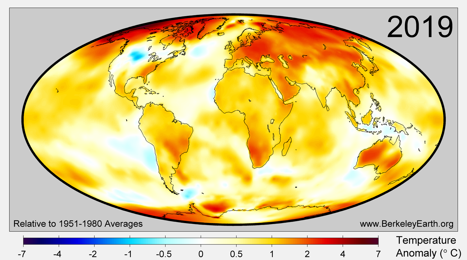
Local temperatures in 2019 relative to the average temperature in 1951-1980.6
When we think about the problem of global warming, a temperature rise of 1℃ can seem small and insignificant.
Not only is it true that 1℃ of rapid warming itself can have significant impacts on climate and natural systems, but also that this 1℃ figure masks the large variations in warming across the world.
In the map shown – taken from the Berkeley Earth global temperature report – we see the global distribution of temperature changes in 2019 relative to the period 1951 – 1980.7 This period of 1951 to 1980 is similar to the period global average time-series shown in the section above.
There are a couple of key points that stand out.
Firstly, the global average temperature rise is usually given as the combined temperature change across both land and the sea surface. But it’s important to note that land areas change temperature, both warming and cooling much more than oceanic areas.8 Overall, global average temperatures over land have increased around twice as much as the ocean. Compared to the 1951 – 1980 average, temperatures over land increased by 1.32 ± 0.04 °C. Whereas, the ocean surface temperature (excluding areas of sea ice) increased by only 0.59 ± 0.06 °C.
Since the Northern Hemisphere has more land mass, this also means that the change in average temperature north of the equator has been higher than the south.
Secondly, from the map shown, we see that in some regions the temperature change has been much more extreme. At very high latitudes – especially near the Poles – warming has been upwards of 3°C, and in some cases exceeding 5°C. These are, unfortunately, often the regions which could experience the largest impacts such as sea ice, permafrost and glacial melt.
Monitoring the average global temperature change is important, but we should also be aware of how differently this warming is distributed across the world. In some regions, warming is much more extreme.
How are greenhouse gas emissions and concentrations changing?
IN THIS SECTION
- Atmospheric concentrations of CO2 continue to rise
- Global emissions have not yet peaked
- Current climate policies will reduce emissions, but not quickly enough to reach international targets
Atmospheric concentrations of CO2 continue to rise
To slow down – with the eventual aim of halting – rising global temperatures, we need to stabilize concentrations of CO2 and other greenhouse gases in Earth’s atmosphere.9 This link between global temperatures and greenhouse gas concentrations – especially CO2 – has been true throughout Earth’s history.10 It’s important to note that there is ‘lag’ between atmospheric concentrations and final temperature rise – this means that when we do finally manage to stabilize atmospheric concentrations, temperatures will continue to slow rise for years to decades.11,12
But, far from stabilizing concentrations, greenhouse gases continue to accumulate.
In the chart here we see global average concentrations of CO2 in the atmosphere over the past 800,000 years. Over this period we see consistent fluctuations in CO2 concentrations; these periods of rising and falling CO2 coincide with the onset of ice ages (low CO2) and interglacial (high CO2).13 These periodic fluctuations are caused by changes in the Earth’s orbit around the sun – called Milankovitch cycles.
Over this long period, atmospheric concentrations of CO2 did not exceed 300 parts per million (ppm). This changed with the Industrial Revolution and the rise of human emissions of CO2 from burning fossil fuels. We see a rapid rise in global CO2 concentrations over the past few centuries, and in recent decades in particular. For the first time in over 800,000 years, concentrations did not only rise above 300ppm but are now well over 400ppm.
It’s not only the level of change CO2 in the atmosphere that matters, but also the rate that this has changed. Historical changes in CO2 concentrations tended to occur over centuries or even thousands of years. It took us a matter of decades to achieve even larger changes. This gives species, planetary systems and ecosystems much less time to adapt.
Global emissions have not yet peaked
To stabilize (or even reduce) concentrations of CO2 in the atmosphere, the world needs to reach net-zero emissions. This requires large and fast reductions in emissions.
Are we making progress towards this? How far are we from this target?
At a time when global emissions need to be falling, they are in fact still rising, as the chart here shows. The world has not yet peaked.
Current climate policies will reduce emissions, but not quickly enough to reach international targets
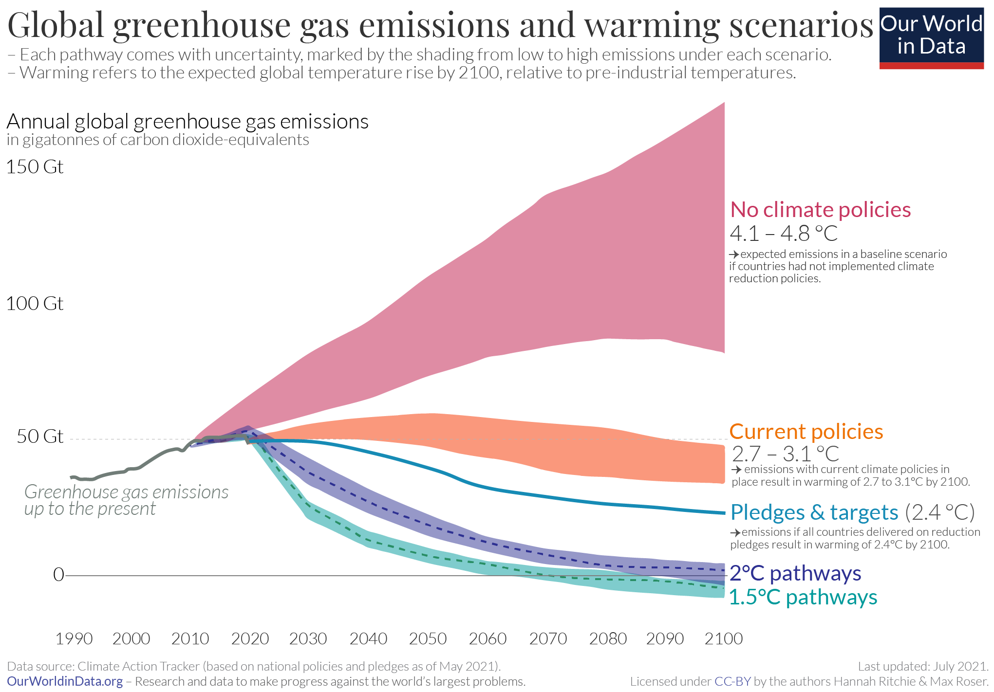
Current policies to reduce, or at least slow down growth, in CO2 and other greenhouse gas emissions will have some impact on reducing future warming.
As we see in the chart shown here, current implemented climate and energy policies would reduce warming relative to a world with no climate policies in place. This chart maps out future greenhouse gas emissions scenarios under a range of assumptions: if no climate policies were implemented; if current policies continued; if all countries achieved their current future pledges for emissions reductions; and necessary pathways which are compatible with limiting warming to 1.5°C or 2°C of warming this century.14
If countries achieved their current ‘Pledges’ (also shown on the chart), this would be an even further improvement. In this regard, the world is making some progress.
But if our aim is to limiting warming to “well below 2°C” – as is laid out in the Paris Agreement – we are clearly far off-track.
Robbie Andrew, senior researcher at the Center for International Climate Research (CICERO), mapped out the global emissions reduction scenarios necessary to limit global average warming to 1.5°C and 2°C. Based the IPCC’s Special Report on 1.5°C and Michael Raupach’s work, published in Nature Climate Change, these mitigation curves show that urgent and rapid reductions in emissions would be needed to achieve either target. And the longer we delay a peak in emissions, the more drastic these reductions would need to be.
We may be making slow progress relative to a world without any climate policies, but we are still far from the rates of progress we’d need to achieve international targets.
Can we make progress in reducing emissions?
Some countries reduced emissions whilst increasing GDP – even when we take into account outsourced production
There is a strong link between CO2 emissions, prosperity and standards of living – we look at this in much more detail, with the data, in our page on Emissions Drivers.
Therefore, if we’re to ask the question: “have any countries demonstrated that we can make progress in reducing emissions?”, they would have to achieve both:
- High standards of living;
- Low levels of emissions, or at least large reductions in emissions to maintain that standard of living.
There are many countries that meet one criterion: rich countries that have high standards of living, but also high levels of emissions; and poor countries that have low levels of emissions but poor standards of living.
But, some countries have shown signs of progress. A number of countries have shown in recent years that it is possible to increase GDP whilst also reducing emissions. We see this in the chart which shows the change in GDP, GDP per capita, and annual CO2 emissions. Both production- and consumption-based CO2 emissions are shown – consumption-based emissions correct for traded goods and services, so we can see whether emissions reductions were only achieved by “offshoring” production to other countries.
A number of countries – such as the USA, UK, France, Spain, Italy, and many others – have managed to reduce emissions (even when we correct for trade) whilst increasing GDP.
The more important question is “Can we make progress fast enough?”
So we can see numerous examples of countries, with high standards of living, which have been successful in reducing emissions. This is a clear signal that it is possible to make progress.
But the key question here is probably less: “can we make progress?”, but rather “can we make progress fast enough?”.
As we explored earlier in this article, the world is currently far off-track from our 2°C target. If this is our definition of “fast enough” then we have little historical evidence to suggest that most, or even some, countries can reduce emissions (whilst maintaining high living standards) at the speed needed to achieve this.
We can make progress, but it’s currently too slow. We need large-scale acceleration of these efforts across the world.
How do we make progress in reducing emissions?
To make progress in reducing greenhouse gas emissions, there are two fundamental areas we need to focus on: energy (which encapsulates electricity, heat, transport, and industrial activities) and food and agriculture (which includes agriculture and land-use change, since agriculture dominates global land use).
Below we’ve listed some of the key actions we need to make progress in each area. At a very basic level they can be summarised by two core concepts: improving efficiency (using less energy to produce a given output; and using less land, fertilizer and other inputs for food production, and reducing food waste); and transitioning to low-carbon alternatives (in energy, this means shifting to renewables and nuclear; for food, this means substituting carbon-intensive products for those with a lower carbon footprint).
How can we decarbonize our energy systems?
- Shift towards low-carbon electricity (reduce carbon intensity – carbon per unit energy)
– Renewables
– Nuclear energy
– Shift from coal to gas (which emits less CO2 per unit energy) as an interim step
→ Explore our work on energy.
→ Explore our data on CO2 emissions by fuel type - Shift sectors such as transport, towards electricity. Some energy sectors are harder to decarbonize – for example, transport. We, therefore, need to shift these forms towards electricity where we have viable low-carbon technologies.
→ Explore our data on greenhouse gas emissions by sector. - Develop low-cost low-carbon energy and battery technologies. To do this quickly, and allow lower-income countries to avoid high-carbon development pathways, low-carbon energy needs to be cost-effective and the default choice.
- Improve energy efficiency – energy per unit GDP.
→ Explore our data on energy intensity.
How can we reduce emissions from food production and agriculture?
- Reduce meat and dairy consumption, especially in higher-income countries. Shift dietary patterns towards lower-carbon food products. This includes eating less meat and dairy generally, but also substituting high-impact meats (e.g. beef and lamb) for chicken, fish, or eggs. Innovation in meat substitutes could also play a large role here.
→ Read our article on the carbon footprint of meat and dairy versus alternative foods.
→ Explore our work on meat and dairy production. - Promote lower-carbon meat and dairy production. We are not going to cut out meat and dairy production completely any time soon (and doing so is unnecessary – large reductions would be sufficient). This makes the promotion of lower-carbon production methods essential.
→ Read our article on the large differences in carbon footprint for specific meat and dairy products. - Improve crop yields. Sustainable intensification of agriculture allows us to grow more food on less land. This could help to prevent deforestation from agricultural expansion, and frees up land for replanting, or giving back to natural ecosystems.
→ Explore our work on Crop Yields. - Reduce food waste. Around one-third of food emissions come from food that is lost in supply chains or wasted by consumers. Improving harvesting techniques, refrigeration, transport and packaging in supply chains; and reducing consumer waste can reduce emissions significantly.
→ Read our article on GHG emissions from Food Waste.